Why Earth Toned Nature Art Belongs on Your Walls in 2026
We live in a world that is increasingly loud, fast, and disconnected from the natural world. Our homes should be our sanctuary. Too often though, our walls are filled with cold sterile nothing. Stark whites, blank grey. These spaces look like they've been staged for a real estate listing rather than actually being lived in.
Something is shifting in 2026 and I think it's long overdue.
Interior designers are calling it warm minimalism. I'd call it a return to what actually matters. Bringing the quiet grounding energy of the natural world back inside with us. Not through clutter or through cheap seasonal trends, but through intentional and meaningful art that makes you feel relief the moment you walk into the room.
Beyond "Sad Beige" — The Colors That Actually Breathe Life Into a Space
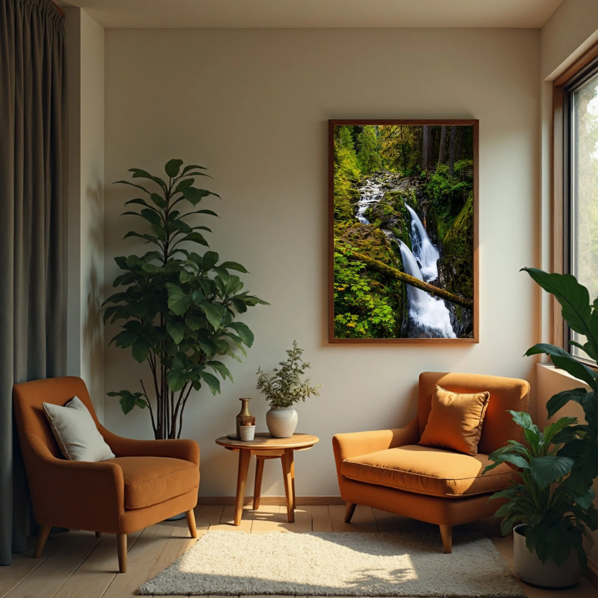
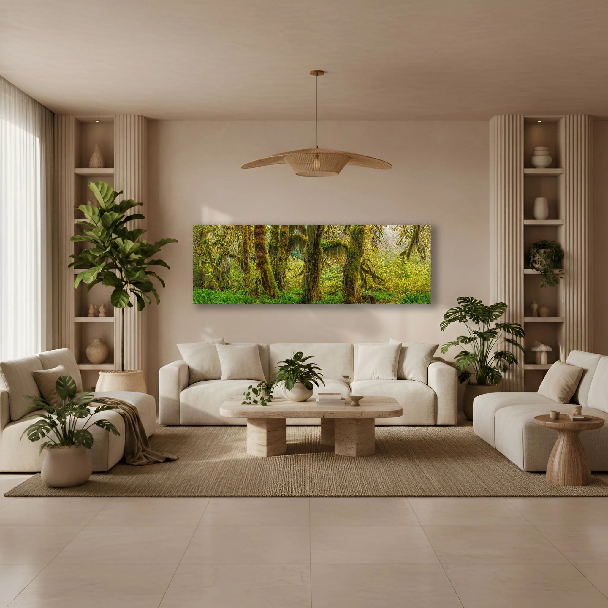
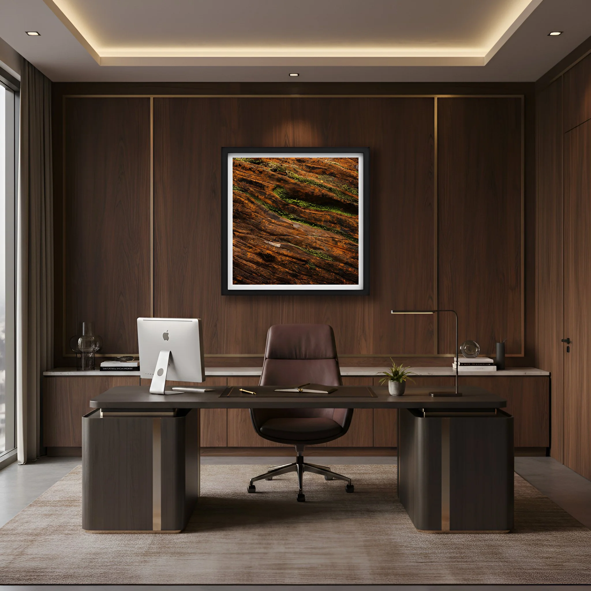
“Sol Duc Falls” Running at a lower level just before the autumn rains, only two sections are flowing over the edge. “Sol Due Falls” green tones go perfectly with the warm furniture colors creating a corner oasis.
For years minimalism meant an absence of color. White walls, grey furniture, the visual equivalent of a waiting room. People began calling it "sad beige," and they weren't wrong. A space without warmth isn't peaceful, it's empty.
The palette that's resonating right now pulls directly from the earth itself. Terracotta and clay carry the warmth of handmade pottery. The feeling of sun baked desert earth, of something that feels like it has history. Sage and deep moss do what spending actual time in a forest does. They quiet the nervous system and remind you that something much older and steadier than your inbox exists just beyond your door. Ochre and raw umber cast a permanent golden hour glow. The kind of soft amber light that makes everything feel a little more human.
There's real science behind why these tones work. Exposure to nature inspired greens and warm earth tones has been shown to lower cortisol levels by up to 18%. Your nervous system recognizes these colors. They signal safety and rest. They tell some ancient part of your brain that you are somewhere worth stopping.
The Art That Belongs in This Space
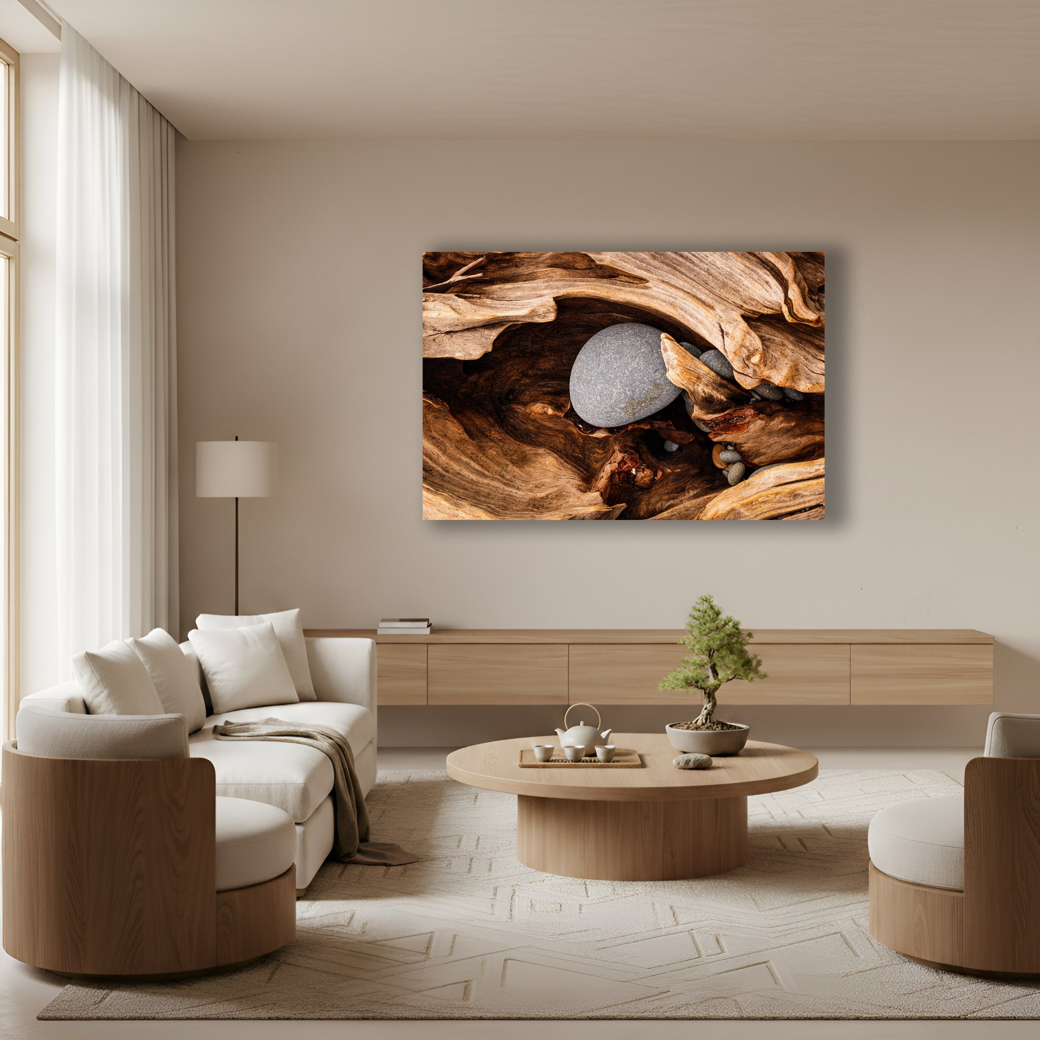
“Guardian’s Embrace” The piece of driftwood embraces the rocks inside a hole in the log. The visual language of “Guardian’s Embrace” allows your eyes to wonder around the textures of the wood and stones.
In 2026, the nature prints worth hanging aren't illustrations from a field guide. They're art that makes you feel something. Images that invite your eyes to slow down and wander rather than scan and move on.
The styles I'm seeing resonate most deeply are the ones that honor nature's own visual language. Abstract botanicals replace rigid botanical drawings with something that feels alive and in motion. Macro photography brings you face to face with the texture of moss, the grain of stone, the quiet geometry of sand. These close up views remind you that the natural world is endlessly intricate if you're willing to look. And then there are the fractal patterns. The Fibonacci sequences that spiral through a sunflower head, a nautilus shell, a breaking wave. Your brain recognizes these patterns before you consciously register them. They create an instinctive sense of order and peace.
What all of these have in common is that they ask you to be present. Not to scroll past but to stand still and look.
What the Art Is Made Of Matters
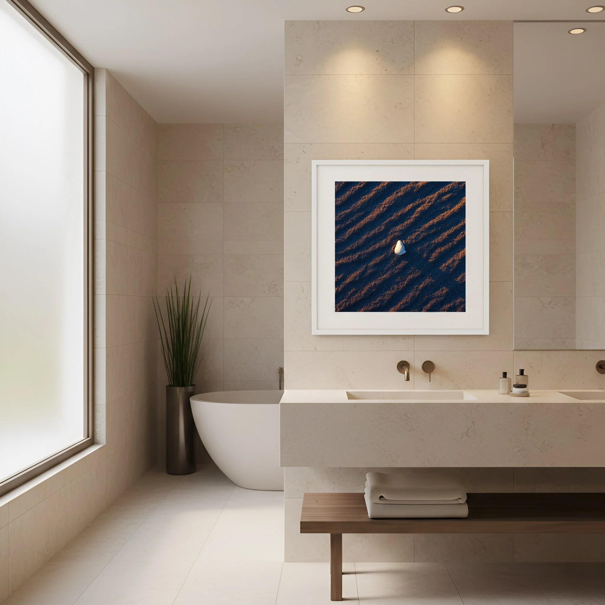
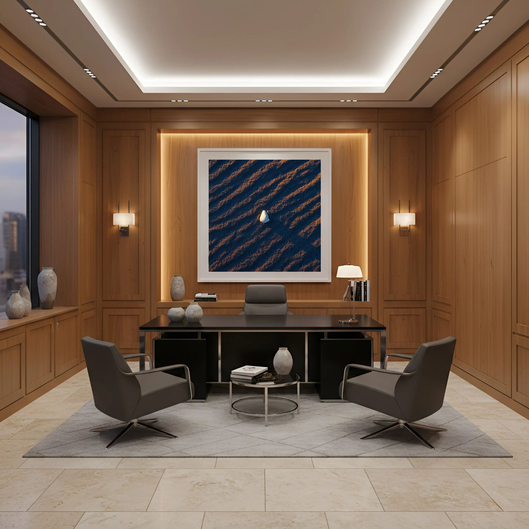
“Held By The Light” A lone shell sits on ripples of sand as sunrise illuminates the gentle ridges in the sand. “Held By The Light” brings nature’s textures and colors into the bathroom.
A print that celebrates the natural world should be made with respect for it. This is something I feel personally. It's why I use only museum grade materials and donate 5% of every sale to conservation.
The broader industry is catching up. Hemp paper which requires a fraction of the water conventional paper demands and grows rapidly without depleting the soil is becoming a standard for quality fine art printing. Soy based inks replace petroleum derived chemicals with biodegradable alternatives that actually produce richer longer lasting color. And frames are being stripped back to their raw material. White oak left in its natural sandy state or smoked walnut allowed to show its true warmth. No heavy lacquers or plastic veneer. Just the wood as it actually is.
When the entire piece, the image, paper, ink, and frame honors the natural world, it stops being décor and starts being a statement about what you value.
How to Hang It
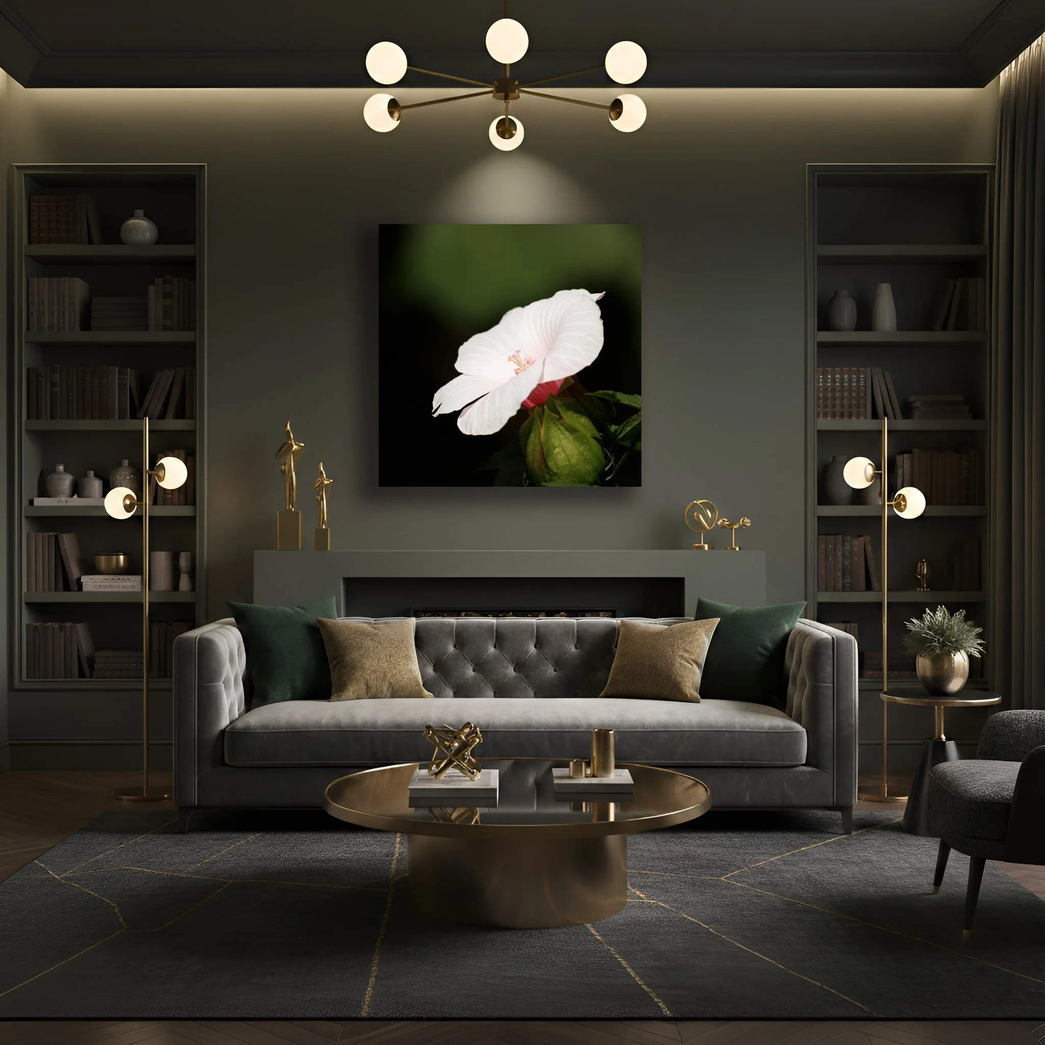
“Swamp Mallow” Soft white lines of the hibiscus stand apart from the green tones of nature surrounding the flower. “Swamp Mallow” pops with white but the greens of the background mirror the wall and decor of the room.
If you've been drawn to gallery walls, the clusters of many small prints, I'd encourage you to reconsider. That approach often creates visual noise, the opposite of what we're after. In 2026 the most powerful move is a single oversized focal point. One large piece that commands a wall and gives your eyes somewhere to land and rest.
The technique designers call "color drenching" takes this a step further. When the primary tones of your print mirror the wall behind it, the art doesn't compete with its surroundings, it becomes part of them. A terracotta print on a terracotta wall doesn't disappear. It creates a seamless warmth that wraps the entire room. The effect is less "art on a wall" and more “the room itself is the sanctuary.”
Hang your prints near soft shapes. Rounded mirrors, curved furniture, or arched doorways. The organic lines in nature photography or botanical art echo these forms naturally. The room begins to feel less like a collection of objects and more like a single coherent breath.
Fewer Things, Chosen Carefully
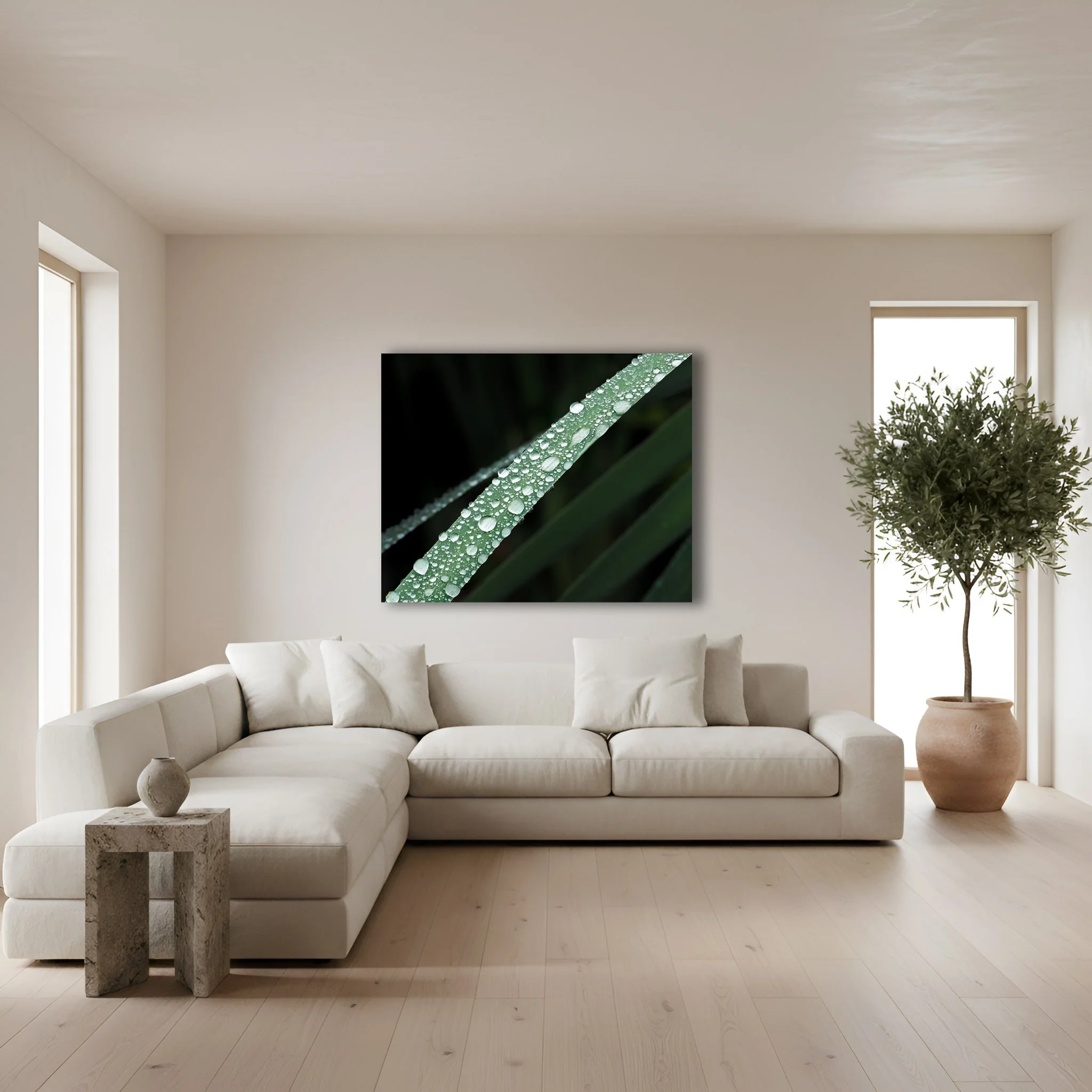
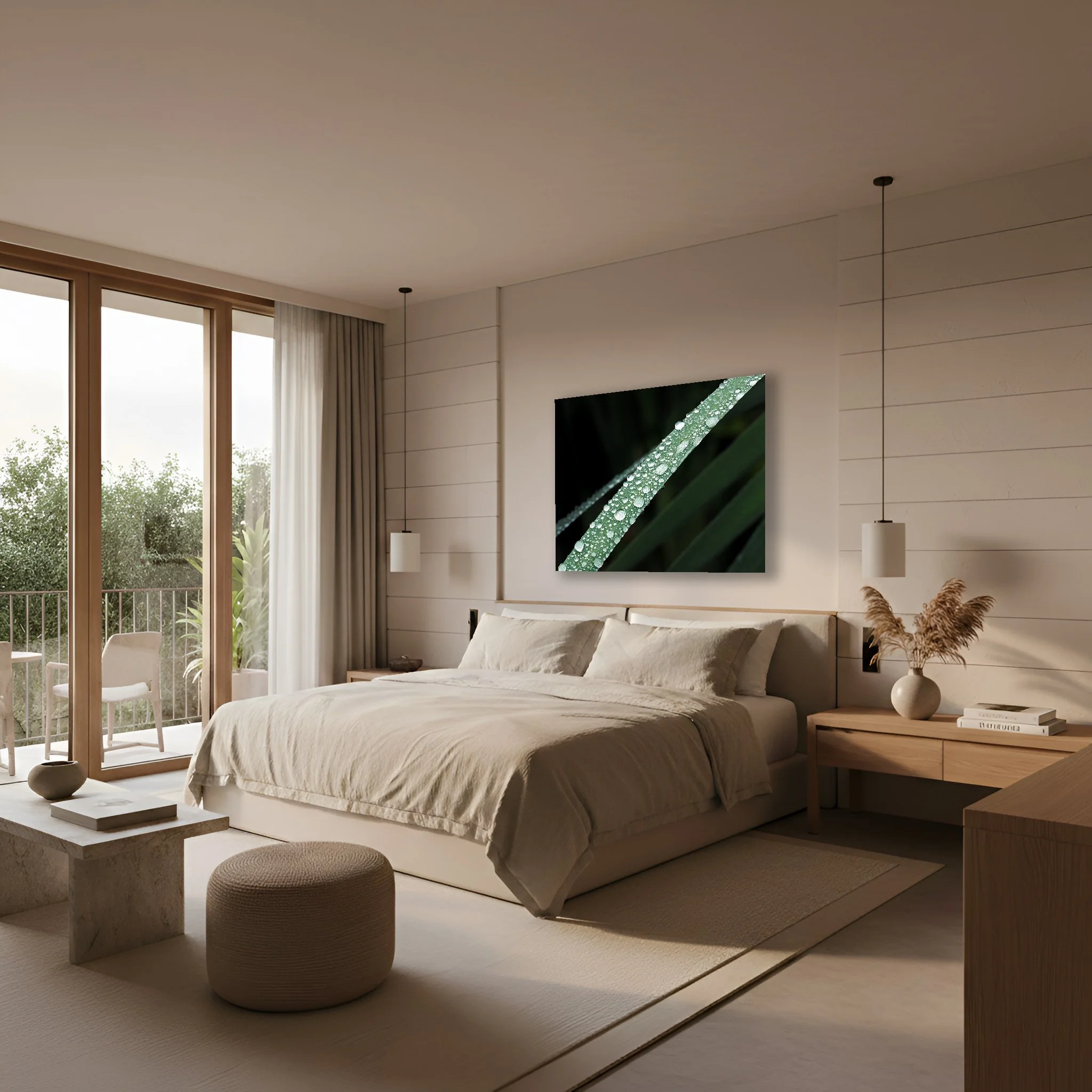
“Bejeweled” Water droplets rest on this macro shot of a blade of grass. The natural colors of “Bejeweled” will never go out of style as other fads pass with time.
The most lasting lesson of Warm Minimalism is the same one that guides how I approach my own work. Fewer and better things. One high quality meaningful print in a natural wood frame does more for a room than a dozen disposable pieces combined.
Natural colors like sage, terracotta, ochre, and clay don't go out of style because they aren't trends. They are the colors of the world that existed long before interior design was a concept and will exist long after the next aesthetic cycle fades. When you choose art rooted in those colors, in natural textures, in respect for the natural world, you're not decorating for the season. You're building a space that will still feel true to you years from now.
We spend so much of our lives staring at screens under fluorescent lights disconnected from the very planet we depend on. Our homes are one of the few places where we have genuine control over the environment around us.
Hanging a piece of nature art that you chose carefully, that actually moves you, is a quiet act of reconnection. It's a window to the wild when you can't be out in it. It's a reminder that every time you walk past it, that the world is still extraordinary and still worth protecting.
That's what great nature photography should do. Not just fill a wall but fill the room with something that matters.
How to Choose a Large Statement Nature Print for Your Space
That blank wall isn’t just empty, it’s waiting.
A large statement nature print has the power to transform a room from a place you simply live in to a space that actually moves you. This is the essence of biophilic design, not decoration but reconnection. And in an era when our homes have become everything, an office, a refuge, a sanctuary, the art we choose to live with matters more than ever.
But choosing the right piece can feel overwhelming. Scale, color, framing, and placement all play a role. This guide will walk you through each one so that when you finally hang that print, it feels less like decorating and more like coming home.
Start with Scale — It’s Everything
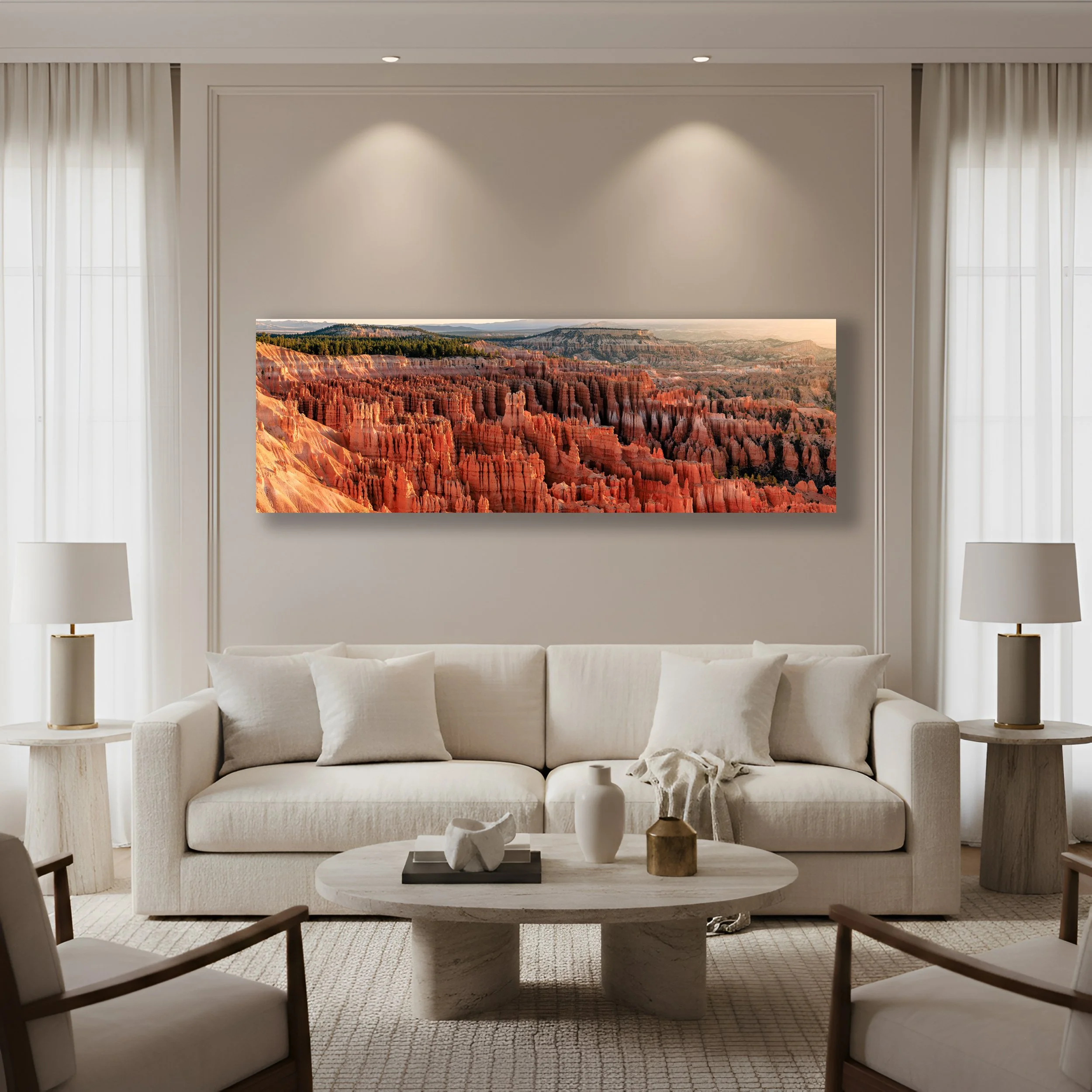
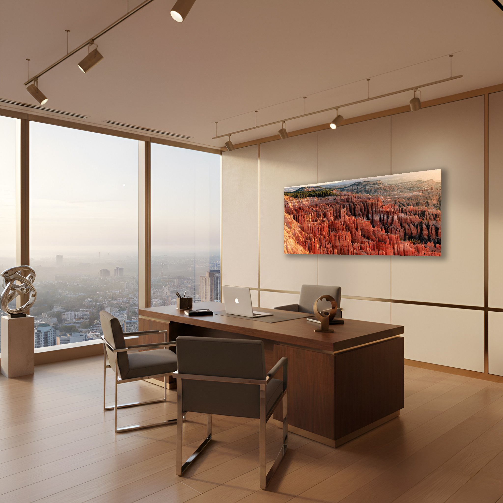
“Symphony of Stone” The first light of sunrise illuminates the orange hues of the Bryce Canyon Amphitheater. “Symphony of Stone” delivers a warm earthy palette perfectly aligned with the current trend toward organic interiors.
The most common mistake people make when choosing wall art is thinking too small. A print that’s too modest for the wall it occupies will always look like an afterthought. It will float, lost and disconnected, rather than anchoring the room the way a true statement piece should.
Here’s a simple principle to carry with you. Your art should cover roughly 60 to 75 percent of the available wall space. If you’re working with an open expanse of wall, multiply its width by 0.60. That’s your minimum size. Anything smaller and the room will feel unresolved.
When you’re hanging art above furniture such as a sofa, a bed, or a credenza, let the furniture set the proportion. Your print should span approximately two thirds of whatever sits beneath it. A 90 inch sofa calls for a print around 60 inches wide. That relationship between object and art is what creates a sense of visual balance. It shows intention.
And don’t overlook orientation. In a room with high ceilings, a vertical portrait print draws the eye upward lending the space even more height and drama. In a long low room, a horizontal landscape fills the wall with the same sweeping breadth as the scene it depicts.
Before you commit to anything, do this. Grab a roll of blue painter’s tape and outline the exact dimensions of the print you’re considering directly on the wall. Live with that rectangle for a day. Sit on the couch, stand in the doorway, look at it from across the room. If it feels too small then go larger. If it dominates then scale back. The tape test has saved more collectors from regret than any measuring app ever will.
Consider the Feeling You Want to Live With
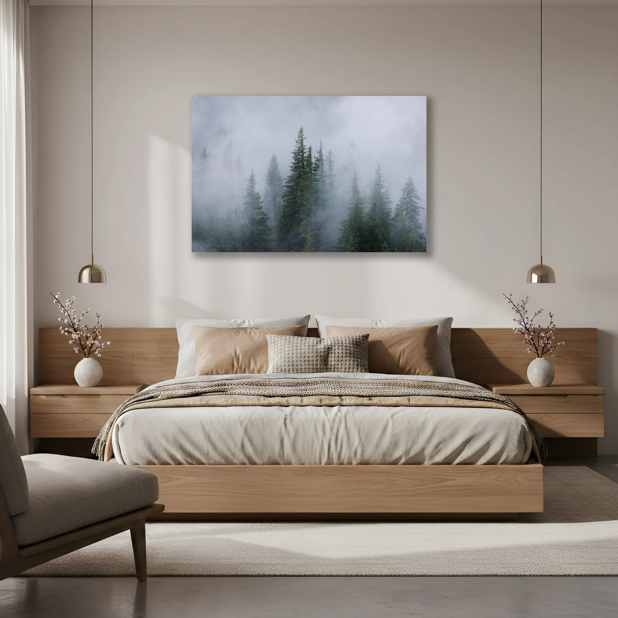
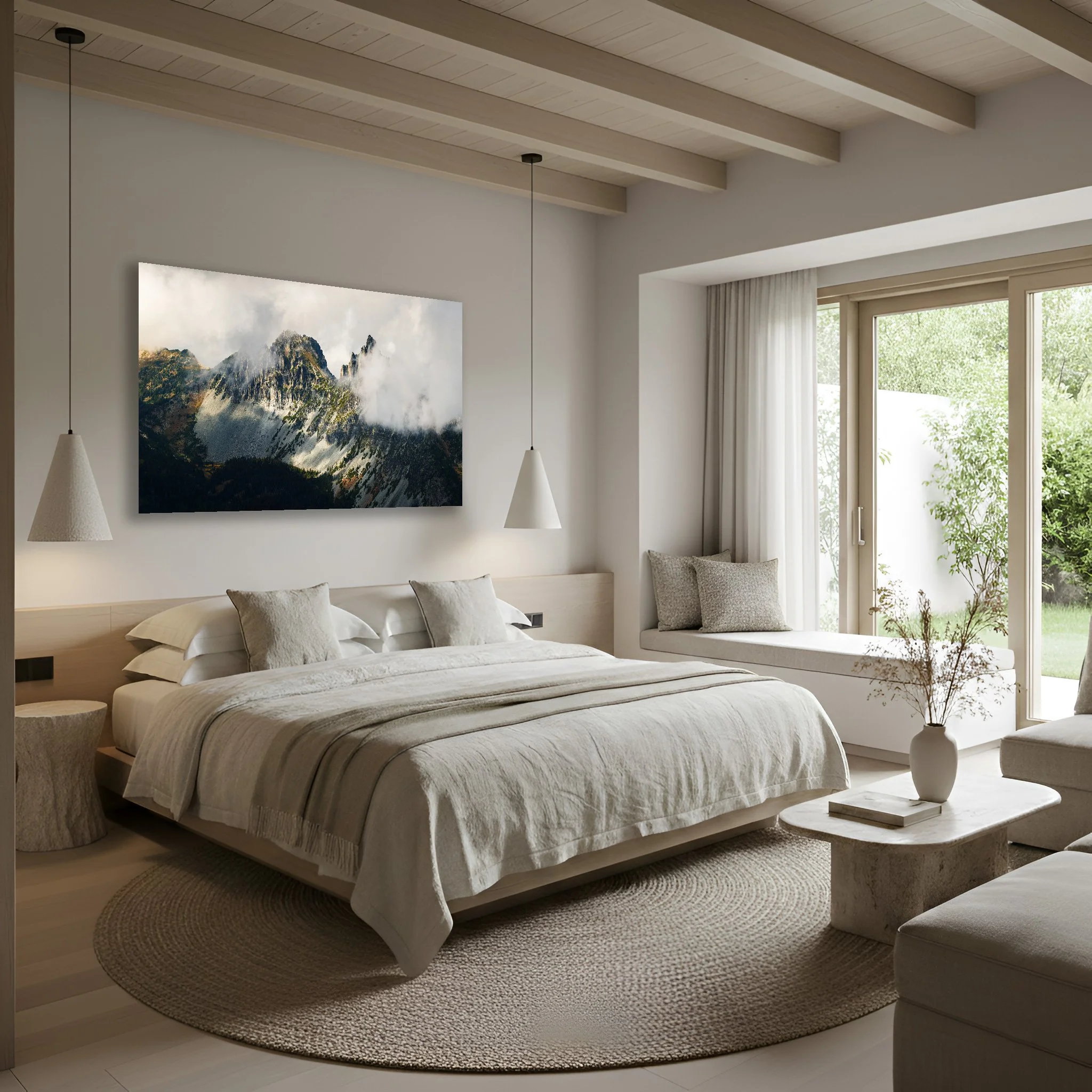
“Evergreen Dreams” Fog moves in and out of an evergreen forest in the Pacific Northwest. “Evergreen Dreams” muted grey and green tones along with meditative verticals brings a deeply calming mood to your bedroom.
Every great piece of art makes you feel something. Before you choose a subject ask yourself this question. How do I want to feel when I walk into this room?
Some spaces call for stillness. Soft light, open sky, the quiet of a misty forest or the hush of a snowfield. Bedrooms and bathrooms thrive with this kind of imagery. The goal is rest. The goal is to exhale.
Other rooms are made for energy. A living room or entryway welcomes prints that demand attention. The electric green of a tropical canopy, the flame of an autumn forest, the vivid geometry of a wildflower in full bloom. These are conversation pieces. They invite you in.
And then there are the spaces where you do your most focused work. A home office or den benefits from something grounding. Earthy, steady, geological. The vast silence of a canyon. The weight of a mountain. These images don’t distract you, they anchor.
When in doubt look around at what’s already in the room. If your textiles are neutral, soft linens, quiet grays, then a bold and vivid print will elevate the whole space. If the room already has color and personality then a more serene image can bring balance without competition.
Works with Your Color Palette, Not Against It
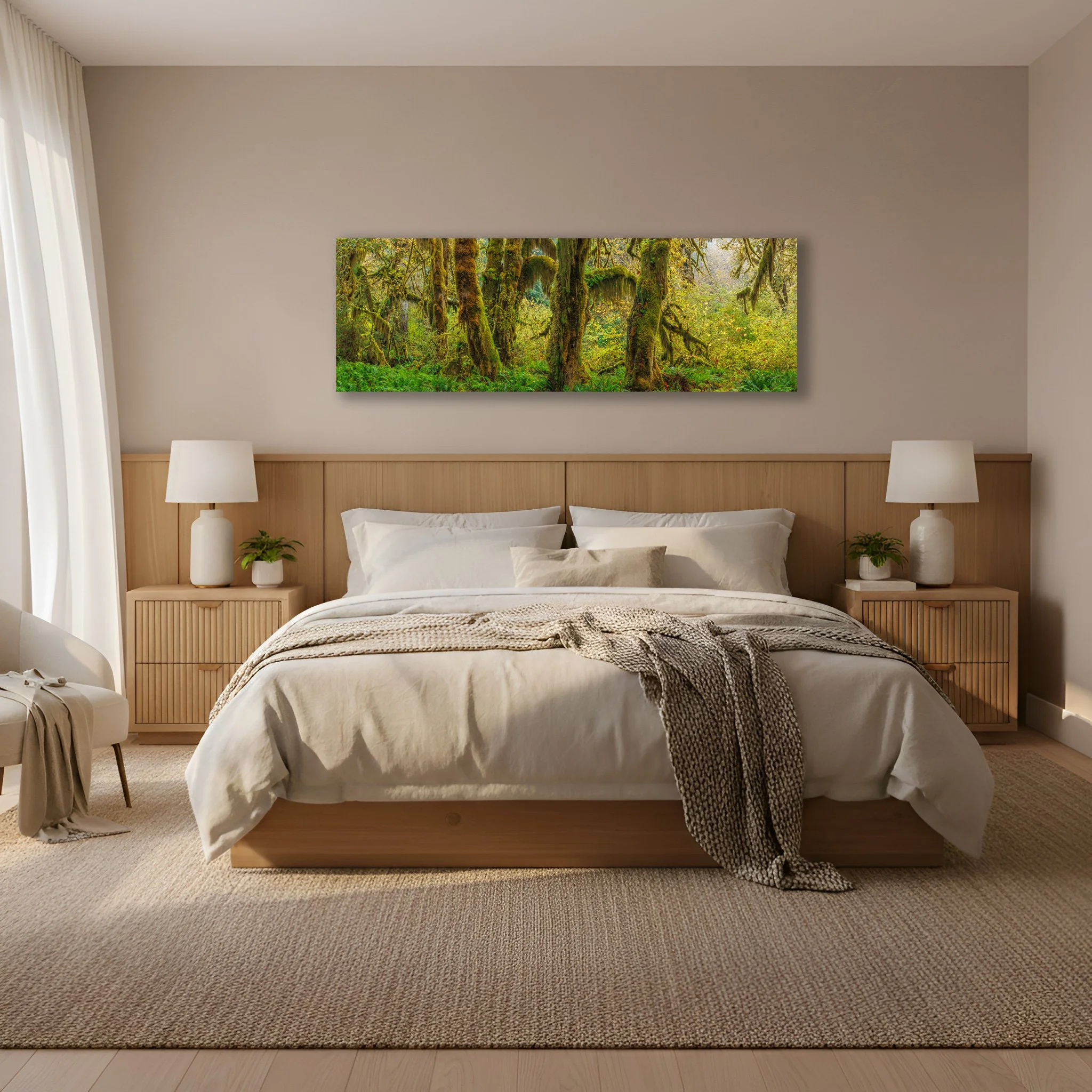
“Hall of Mosses” The lush emerald cathedral of moss draped maples in the Hoh Rainforest. “Hall of Mosses” is perfect for clients searching for nature immersive interiors and biophilic design.
Color is the language your room is already speaking. Your print should join that conversation, not interrupt it.
If you want your art to become the undeniable focal point of the room, look for colors that contrast with your walls. A deep green forest print on a warm terracotta wall doesn’t just coexist, it vibrates. That tension between opposites is what makes a room feel alive.
If you’re after something more cohesive, more quietly elegant, look to the colors already present in your rugs, throw pillows, and curtains. A stormy coastal print paired with navy blue textiles doesn’t shout, it harmonizes. The room feels as though it was designed all at once with purpose.
And if your space is already rich with color, there’s something to be said for a beautifully rendered black and white print. The absence of color isn’t a limitation, it’s a choice. Black and white nature photography offers extraordinary texture and depth that complements virtually any palette. It’s the piece that works with everything precisely because it doesn’t compete with anything.
Here’s a simple trick. Photograph your room on your phone and hold it beside the screen as you browse prints. If the colors make you pause, if something in you responds then trust that instinct.
Choose Materials That Honor the Image
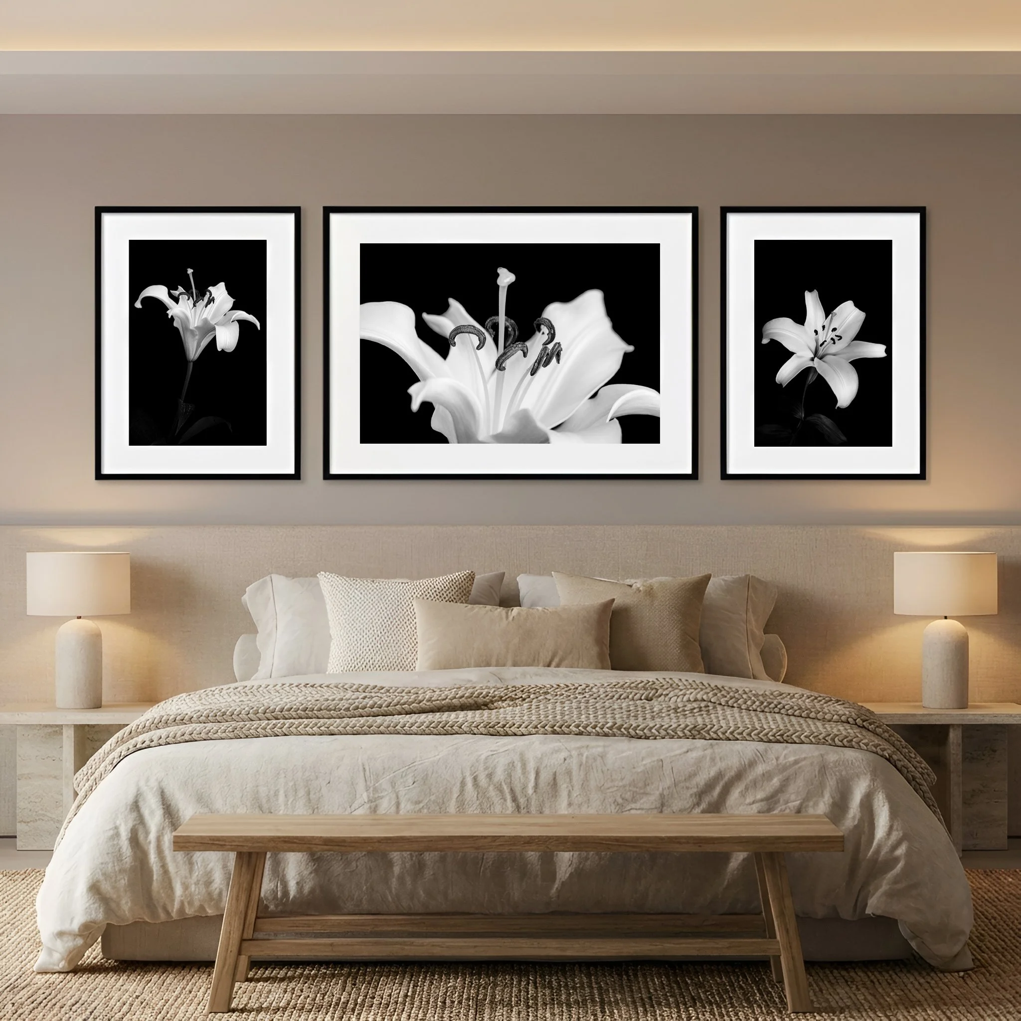
“Form of Lily Triptych” Three distinct photos tell the story of a lily. The shape and the details that make up the form of the flower. “Form of Lily Triptych” shown here printed on fine art paper, mated and framed above the bed, bring an inviting and peaceful mood to the bedroom.
The photograph is only part of the experience. The material it’s printed on shapes how you engage with it every single day.
A fine art paper print framed behind museum glass carries a sense of permanence and craft. It suits a traditional space or a clean modern minimalist room with quiet walls and considered furniture. There’s a warmth to paper, an intimacy. You’re aware that you’re looking at something made with care.
Metal and acrylic prints are a different experience entirely. Colors run deeper, luminosity increases, and the image seems to glow from within rather than simply sit on the wall. These finishes suit bold, high-definition images. A mountain lake or a sunset that feels almost unreal. They’re sleek, durable, and remarkably easy to live with.
One note on lighting. If your space receives a lot of natural light or has bright overhead fixtures, be thoughtful about reflective surfaces. Glossy glass and high sheen acrylic can catch the light in ways that obscure the very details you fell in love with. In a sun drenched room, a matte finish is your ally.
Place It with Intention
Height matters more than most people realize. In museums, curators follow a simple standard. The center of every piece hangs at 57 inches from the floor. This is average eye level for most people and it works because it creates a natural, comfortable relationship between the viewer and the image. Art hung too high feels remote. Art that is too low loses its authority.
There is one exception. When hanging above furniture leave six to eight inches of breathing room between the bottom of the frame and the top of whatever sits beneath it. That gap is what keeps the art connected to the room rather than hovering above it.
And if you’re hanging something substantial take the extra moment to find your wall studs or use proper anchors. A statement print is an investment. It deserves to stay exactly where you intend to put it.
Trust What Moves You
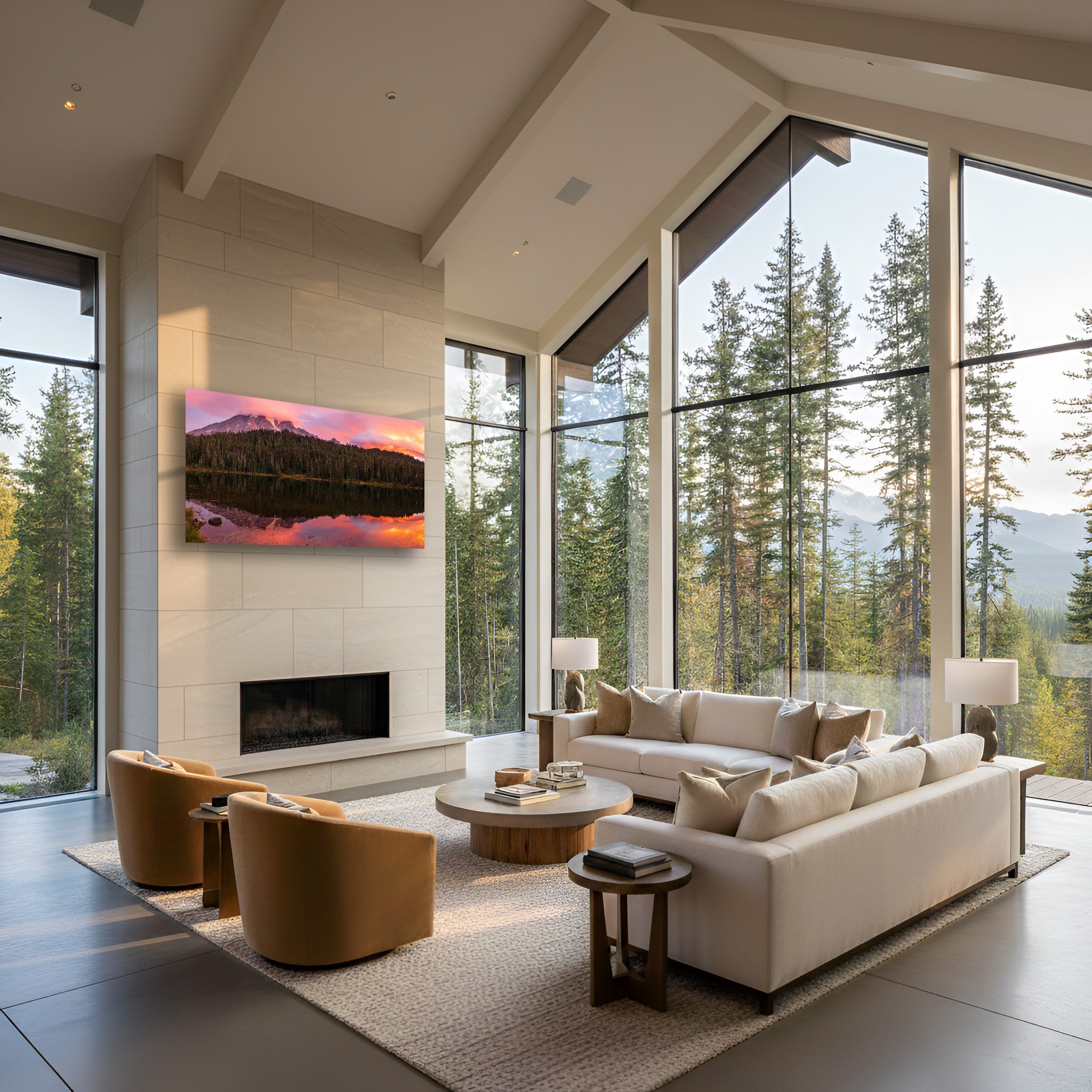
“Crowned By Dawn” Mount Rainier perfectly mirrored in Reflection Lake as the sky erupts with the pink and rose gold colors of sunrise. “Crowned By Dawn” brings presence to the room and makes a great statement piece.
The measurements, ratios, and color principles are tools, not laws. They exist to give you confidence. Not to replace your own response to an image.
If a print stops you mid scroll because it reminds you of a morning you’ll never forget. The light through the trees on a particular hike, the stillness of a lake before anyone else was awake. That recognition is worth more than any formula. Your home should reflect who you are and what you love. Not the pages of a design textbook.
The right nature print isn’t just something you hang on a wall. It’s something you live with. Something that changes the quality of an ordinary Tuesday. Something that when you glance up from whatever you’re doing, makes you breathe just a little easier.
That’s the one test that matters. When you walk into the room and your eyes find the print, does something in you settle?
If the answer is yes, you’ve found your piece.
How to Style an Office with Luxury Nature Wall Art
Most offices weren't designed to inspire us. They were designed to contain us. Four walls, overhead fluorescent lighting, and furniture that exists purely out of function. And if you've ever spent eight hours inside one, you already know what that can do to your mind.
But there's a different way to work. In 2026, the shift toward biophilic office design isn't a trend, it's a recognition that we are not meant to be so cut off from the natural world. When you surround yourself with images that speak to something deeper, a mountain range at dawn or the quiet geometry of a single leaf, you're not just decorating. You're rebuilding a connection your mind was always meant to have.
Choosing Art That Actually Moves You
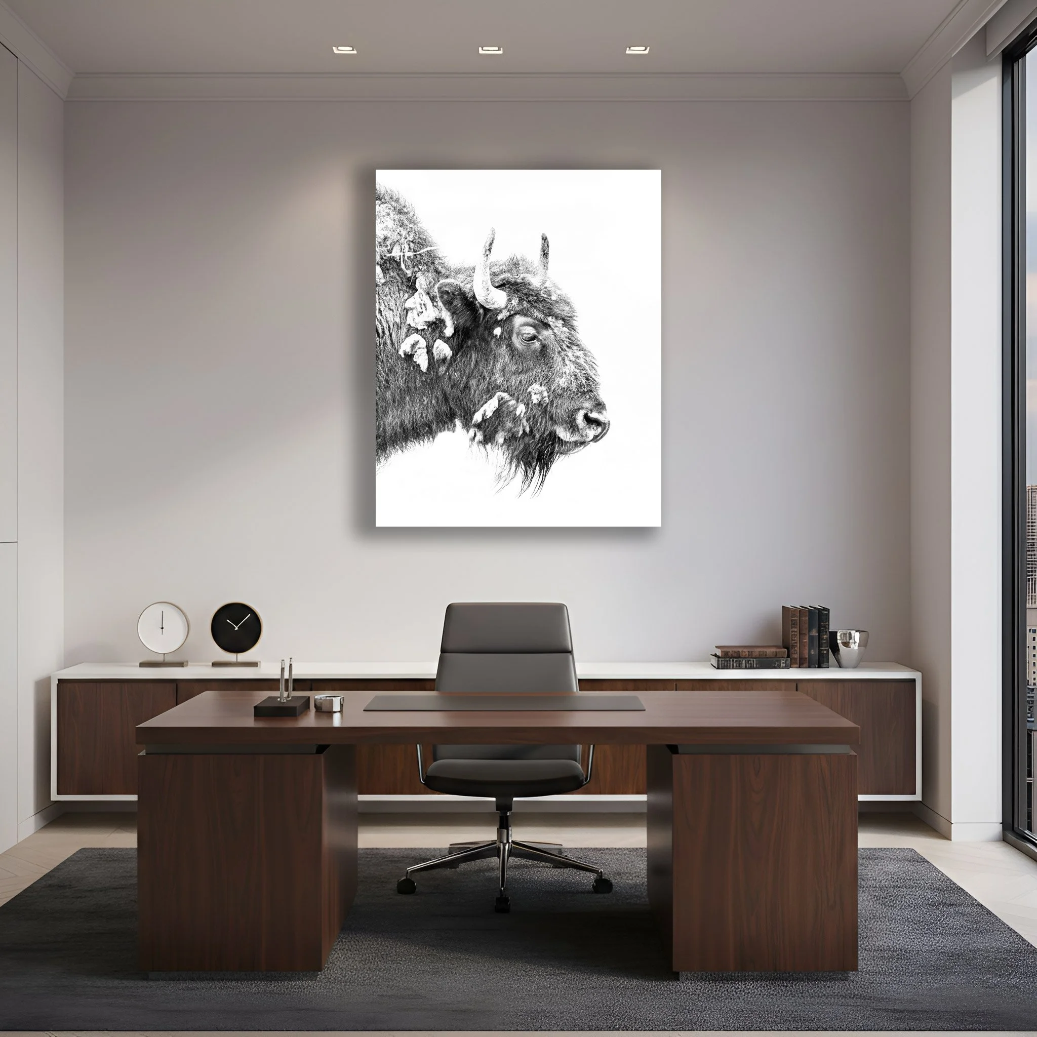
“Bison Bull” Part of the Quiet Sovereignty series of wildlife headshots. The high key imagery allows the piece to anchor the room without competing with existing decor.
There's a difference between art that decorates a wall and art that stops you mid thought. The first fills space. The second changes how a room feels the moment you walk in.
If you want your office to feel like a sanctuary rather than a showroom, move past the stock images. The predictable green forests, the generic coastal blues. Those images are forgettable because they were made to be. Luxury nature art invites you to look differently.
Three subject styles worth considering:
Macro Botanicals: Extreme close ups that transform a single leaf or mineral into something almost architectural. Nature turned abstract, precise and quietly breathtaking.
Aerial Landscapes: A coastline or a forest canopy seen from above becomes a living painting of shape and color. It rewards attention. The longer you look, the more you understand what you're seeing.
Minimalist Wilderness: High contrast black and white photography. A lone tree, a ridgeline in the fog, or a stretch of snow all can carry a stillness that anchors a room. It never overstates. It never goes out of style.
Medium and Material: Where Craft Becomes Quality
The image matters. But so does how it's made. Fine art doesn't live in a flimsy frame. Look for materials that reflect the care that went into creating the work:
Museum Grade Acrylic: Deep saturated color with a glass smooth finish that commands the wall. Feels gallery worthy and not mass produced.
Chroma-Luxe Metal: Vibrant colors with a sleek contemporary presentation that brings photos to life.
Fine Art Paper: Tactile and timeless, fine art paper brings a soft feel that pairs beautifully with natural wood furniture.
Placing Art with Purpose
Even the most powerful image can disappear on the wrong wall. Placement isn't an afterthought, it's part of the curation.
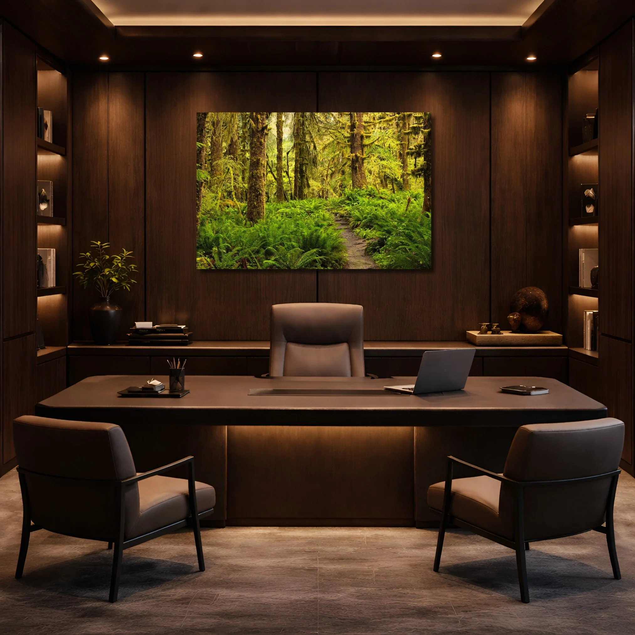
“Where the Forest Breathes” A trail leads though the rainforest in Olympic National Park. The biophilic aspects of this nature print bring peace to workspace.
The Wall Behind Your Desk
In a world of video calls, the wall behind you has become part of how the world sees you. A piece of nature art communicates something about who you are before you speak. Choose something that reflects the clarity you bring to your work.
Hang at Eye Level. Always.
The most common mistake is hanging art too high. Keep the center of your piece at eye level, roughly 57 to 60 inches from the floor. When art is properly grounded, the room settles. It feels intentional and everything breathes.
One Bold Statement or a Triptych?
A single oversized piece reflects you as confident and uncluttered. It says you know exactly what you want. A triptych, one image across three panels, brings rhythm to a wide wall without overwhelming it. Both work beautifully in an office space. The choice comes down to how you want the room to feel, decisive or expansive.
The Colors That Help You Think
Color isn't just decorative, it's physiological. The right tones change how you feel in a space and by extension how you work within it.
“Written by Time” A fine lines that only come with age of this weathered cherry tree. Earth tones in “Written by Time” make your office feel stable and grounded.
Green: Your Eyes Already Know
Green is the easiest color for the human eye to process. After hours of screen glare, a large piece of forest or moss toned art gives your visual system a place to rest. It's not passive, it actively restores your capacity to focus. This is exactly what a serious workspace demands.
Earth Tones: Grounded and Steady
Ochre, sands, and deep brown. These are colors that carry weight without heaviness. They make a room feel stable. When you work inside a space that feels grounded, your thinking follows. The decisions you make in that room feel steadier too.
Let the Art Speak to the Room
Great art doesn't exist in isolation, it converses with everything around it. Match your frame to the wood grain of your desk. Echo the metal finish of your lighting in the finish of your frame. When your art feels like it belongs, the whole room feels like it was designed by someone who pays attention.
The Finishing Details That Elevate Everything
There's a version of fine art that hangs on the wall and quietly disappears. Then there's a version that stops people when they enter the room. The difference is almost always in the details.
“Held by the Light” The sun rises on a single shell casting a long shadow. The mat surrounding “Held by the Light” gives the print room to breath and adds depth to the image.
Frame It Like a Gallery Would
The frame isn't an afterthought, it's part of the art:
Float mounts for metals and acrylics: a small gap between the image and the wall creates the illusion that the piece is hovering. Clean, modern, striking.
Deep set mats for fine art paper: that generous border of mat board between glass and image adds depth. It transforms even a quiet nature photograph into something museum worthy.
Light It Intentionally
Overhead office lighting is almost always wrong for art. It creates glare and flattens the colors. Dedicated picture lights, small lamps that cast a warm downward glow or recessed directional LEDs pointed at your piece will do something remarkable. These lights will make the colors come alive. They tell everyone in the room exactly where to look.
Layer in the Living World
“Symphony of Stone” The sun rises over the hoodoos of Bryce Canyon National Park. Warm natural tones bring life to an otherwise dull office.
The truest expression of biophilic design doesn't stop at the wall. When art and real nature exist together in the same space, something shifts. The image on the wall and the plant in the corner begin to speak the same language. The room becomes an environment, not just a collection of objects.
Place a fiddle leaf fig beside a large forest piece. Set a bonsai or a single succulent on your desk near a smaller work. These aren't decorative gestures, they are continuations of the same idea. That you belong to the natural world, even here while working.
And let texture carry that conversation further. Soft, mossy landscapes pair with wool rugs and linen curtains. Rugged mountain photography looks completely at home beside leather and solid wood. When what you see on the wall echoes what you touch and sit in, the room stops feeling assembled, it feels alive.
Your Office as a Reflection of What You Value
The office you work in is not neutral. It either supports your best thinking or it quietly drains it. The walls either remind you why the work matters or they say nothing at all.
Styling your office with luxury nature photography is really about something simpler. Building a space that keeps you connected to the world that made you. When your environment is beautiful, grounded, and purposeful you show up differently. You think more clearly. You feel less scattered. You're reminded quietly every single morning of what actually matters.
That's worth curating.
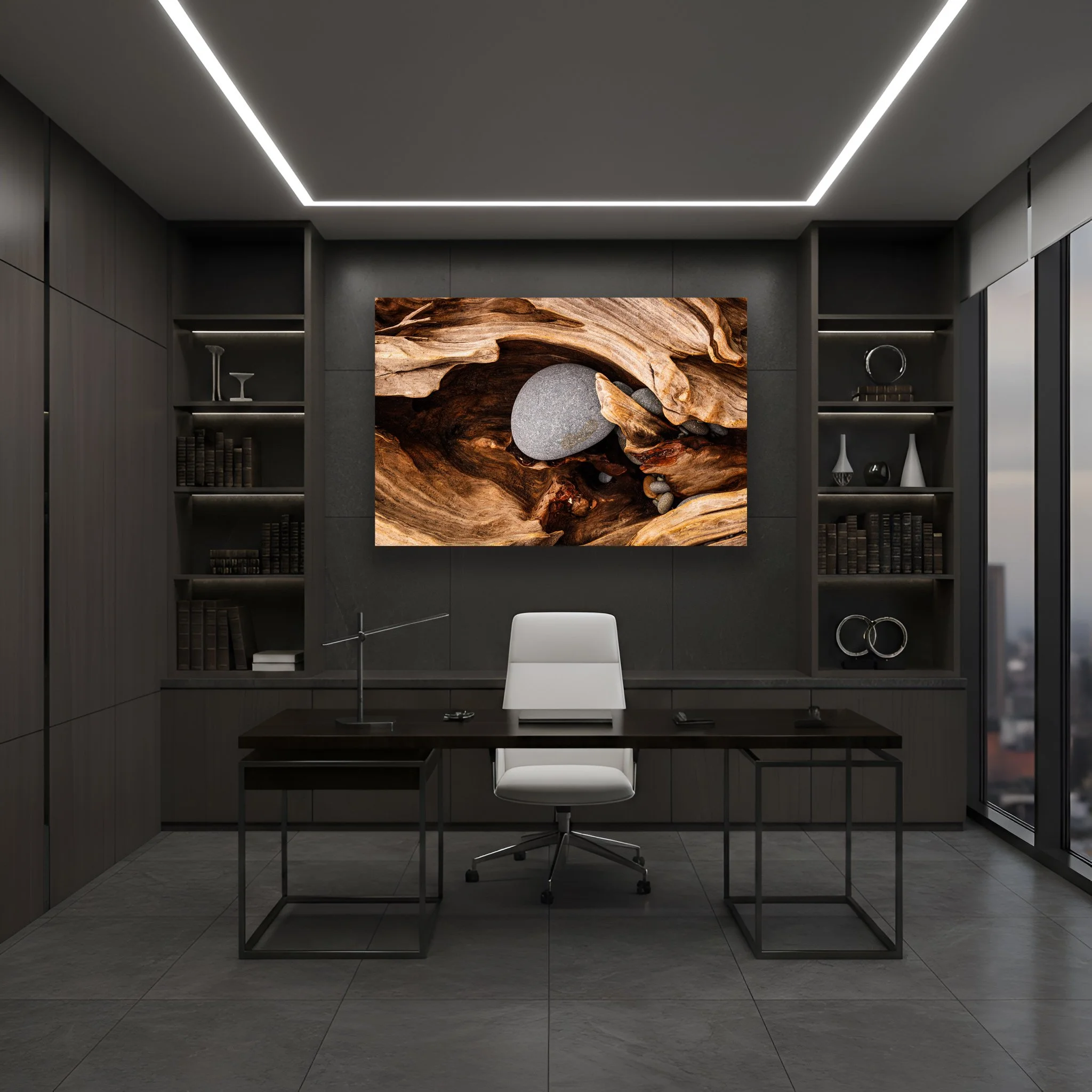
“Guardian’s Embrace” Driftwood that has washed ashore and been filled with rocks from the nearby surf. The warm earth tones contrast with the slate gray of the office bringing a piece of nature to an otherwise sterile environment.
Transform Your Bedroom Into a Sanctuary with Nature Photography
Your bedroom should be more than a place to sleep. It should be your sanctuary, a refuge from the noise and demands of life. Too often our intimate spaces are filled with empty walls or mass produced decor that fails to move us, fails to inspire, and fails to bring the quiet power of nature into our lives.
There is a better way. Through the intentional use of fine art nature photography, you can create a restorative sleep sanctuary that not only elevates your space but reconnects you with the beauty of the natural world. This isn't simply about decorating. It's about designing an environment that serves your wellbeing. Designing an environment that reminds you to breathe and that brings you relief from the chaos of everyday life.
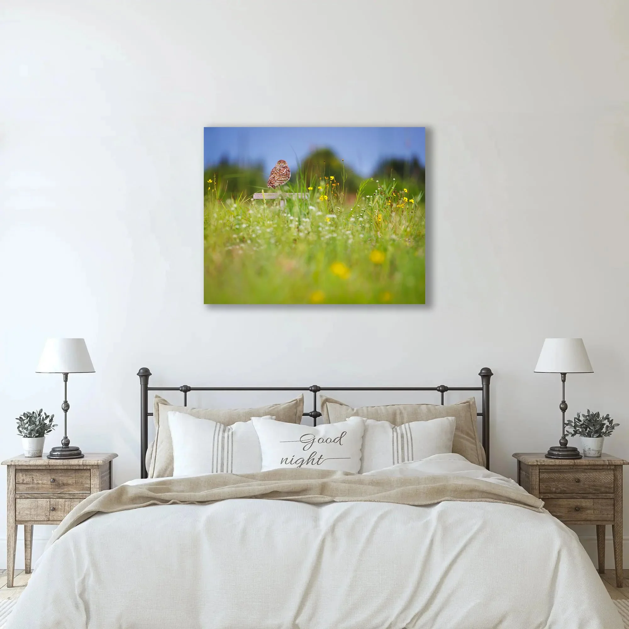
“Keeper of the Meadow” A burrowing owl sits perched looking for its next meal in the meadow. The warm amber and honey tones of the owl's plumage are intrinsically complementary to neutral linen, cream, and warm oak interiors.
Create a bedroom sanctuary through biophilic design, the practice of bringing nature indoors. With intentional nature photography in earth tones and calming palettes, you can design a space that quiets the mind, eases tension, and invites the deep, restorative sleep your body deserves.
Choosing Imagery That Speaks to Your Soul
Before you consider frames or placement, you must first choose photography that resonates with who you are. The images you select will transform the energy of your room the moment you enter. This is deeply personal work. Your bedroom is your sanctuary and the art within it should reflect what brings you genuine peace.
The Language of Color
“Hall of Mosses” Lush emerald cathedral of moss draped maples in the Hoh Rainforest. “Hall of Mosses” biophilic design helps bring peace and relaxation to the bedroom.
Color has profound effects on our emotional state. In a bedroom, where rest and restoration are paramount, your palette matters.
Cool Tones for Deep Calm: Images of oceans, quiet lakes, and misty coastlines carry blues, teals, and soft greys. These colors are known to lower heart rate and invite deep relaxation. The visual equivalent of a long, slow breath.
Earth Tones for Grounded Warmth: If you seek a space that feels embracing and secure, look to forests and mountain landscapes. The greens, browns, and warm tans create a sense of being held by nature itself, a refuge from the outside world.
The Subject of Your Meditation
What appears in your photography is as important as its color.
Intimate Details: Macro photography like the delicate veins of a leaf or morning dew on a petal offers a meditative simplicity. These close observations quiet the mind and bring focus to the small wonders we so often overlook.
Expansive Vistas: Wide landscape views serve as visual windows, especially powerful in smaller bedrooms. They create the illusion of depth and openness, inviting your eyes to wander and your mind to expand beyond the walls that contain you.
Mastering Scale and Placement
Once you've chosen your imagery, thoughtful placement ensures your space feels intentional and harmonious. Poor placement, art hung too high, too small, or without consideration, disrupts the very tranquility you're seeking to create.
The Anchor Wall
The wall behind your headboard is the focal point of your bedroom. This is where your primary piece should live.
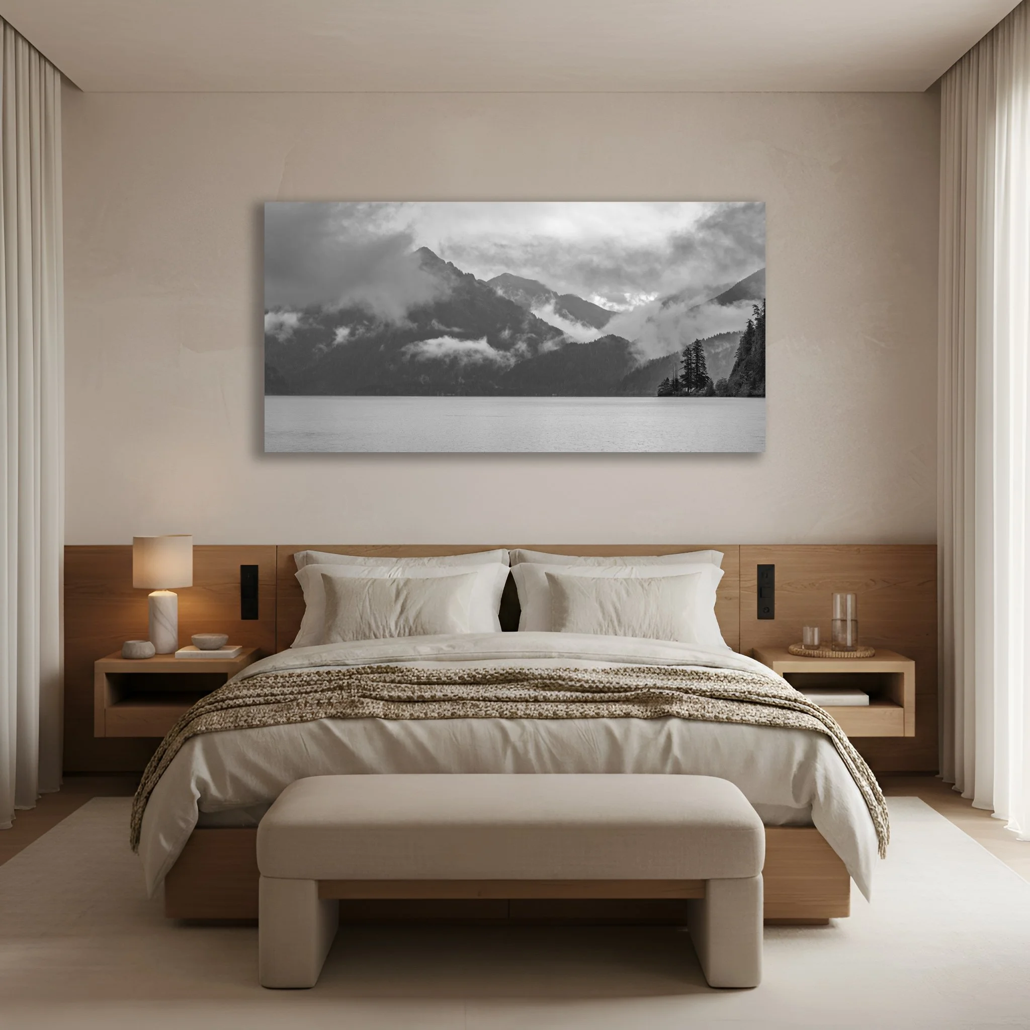
“Olympic Rains” Fog rises in the mountains above Lake Crescent in Olympic National Park. The calming etherial scene of “Olympic Rains” does not compete with color palettes allowing it to go with any room.
The Statement Piece: A single, substantial photograph commands attention with quiet confidence. It creates a sense of clarity and intentionality. Nothing extraneous, only what matters.
The Triptych: A three panel composition allows one image to unfold across your wall. This format offers visual interest while maintaining cohesion, particularly effective for panoramic landscapes that deserve room to breathe.
Proportions That Honor the Space
Your photography should be in dialogue with your furniture, not competing with it or lost against it. A general principle is that your wall art should occupy roughly 60% to 75% of your headboard's width. If your bed spans 60 inches, your photography should measure approximately 36 to 45 inches wide. This creates visual balance, the art and furniture exist in harmony, each honoring the presence of the other.
Height Considerations
Many people hang their art too high creating a disconnect. The center of your photograph should rest at eye level, but remember you experience your bedroom both standing and reclining. Position your work so you can appreciate it from your pillows while ensuring it doesn't feel cramped or overwhelming when you're moving through the space.
Framing That Honors the Natural World
The materials you choose for presentation should complement, not compete with your photography.
“Sluiskin’s Veil” The peak of Mount Sluiskin stands partially obscured by a wave of fog in Mount Rainier National Park. The atmospheric qualities of the fog lend to a calming mood in the bedroom.
Material Selections
Natural Wood: Frames crafted from oak or walnut bring warmth and organic texture. Since these frames originate from trees, they create an intuitive connection with forest and mountain imagery. This choice feels grounded, timeless, and reverent.
Metal Prints: Photography printed directly onto aluminum offers a sleek, contemporary presence. The material itself brings a subtle luminosity, particularly effective with water scenes and winter landscapes where that cool, crisp quality enhances the viewing experience.
Acrylic Prints: When photography is sealed behind substantial acrylic, colors take on remarkable depth and luminosity. The effect is almost dimensional as though you're looking through a window into another world. This is the closest you can come to bringing the wild directly into your space.
The Question of Matting
If you select traditional framing, consider whether you want matting, that border between image and frame.
A generous matte provides breathing room. It allows the photograph to exist without pressure, creating the refined presentation of gallery work. This choice speaks of intention and respect for the art itself.
Metal and acrylic prints typically forgo both matte and frame, floating on the wall with clean, minimal presence. This approach emphasizes the photography itself, nothing between you and the image.
For warmth and tradition, choose wood with matting. For contemporary clarity and vibrant color, consider metal or acrylic.
Creating Harmony with Your Environment
Your photography shouldn't simply occupy wall space, it should be in conversation with every element of your room.
Textural Dialogue
“Evergreen Dreams” Fog moves in and out of an evergreen forest in the Pacific Northwest. “Evergreen Dreams” muted grey and green tones along with meditative verticals brings a deeply calming mood to your bedroom.
The textures in your space can echo the qualities of your photography. A misty forest photograph pairs beautifully with soft wool throws or linen bedding. The tactile softness mirrors the visual softness, creating a cohesive sensory experience that deepens the sense of sanctuary.
Lighting Considerations
Light transforms photography, for better or worse.
Museum Glass: If your photograph faces a window, standard glass will create glare that obscures your image. Museum grade non reflective glass solves this, allowing you to appreciate the full depth and detail of the photograph regardless of natural light.
Warm Ambient Light: Most nature photography reveals its full character under warm lighting. Bedside lamps with warm toned bulbs enhance the golden hour quality of landscape work, making your space feel more inviting as evening settles in.
Consider your photography as the foundation for your room's palette. If your image carries rich forest greens, introduce that color elsewhere in textiles, in ceramics, in small intentional touches that create visual flow throughout your sanctuary.
Your Personal Window to the Wild
“Bejeweled” Intimate shot of beads of rain sitting on a single blade of grass. The intimacy of the shot is perfect for the bedroom or a spa environment.
You've learned about color theory, proportions, and materials. But the most important consideration remains. This is your sanctuary. Your bedroom is both your last sight before sleep and your first view upon waking up. Make certain it's a view that genuinely nourishes you.
Choose Your Calm
Remember that tranquility means something different to each of us. For some peace arrives with the rhythmic crash of ocean waves. For others it's found in the profound silence of mountain peaks or the filtered light of deep forests.
Don't select photography simply because it coordinates with your existing decor. Choose landscapes that genuinely move you, that make you pause, that invite that deep, centering breath. If an image brings you peace, it belongs on your wall.
Design for Restoration
Decorating with intention isn't about aesthetics alone. When you're thoughtful about what surrounds you, particularly in your most private and vulnerable space, you're actively supporting your own wellbeing. By bringing the wild indoors, even in curated form, you create a daily reminder to slow down, to notice beauty, and to reconnect with what matters.
A bedroom designed as a true retreat doesn't just look different. It changes how you rest, how you wake, and how you move through your days. This is the power of living with meaningful art. It transforms not just your space but your life within it.