How to Choose a Large Statement Nature Print for Your Space
That blank wall isn’t just empty, it’s waiting.
A large statement nature print has the power to transform a room from a place you simply live in to a space that actually moves you. This is the essence of biophilic design, not decoration but reconnection. And in an era when our homes have become everything, an office, a refuge, a sanctuary, the art we choose to live with matters more than ever.
But choosing the right piece can feel overwhelming. Scale, color, framing, and placement all play a role. This guide will walk you through each one so that when you finally hang that print, it feels less like decorating and more like coming home.
Start with Scale — It’s Everything
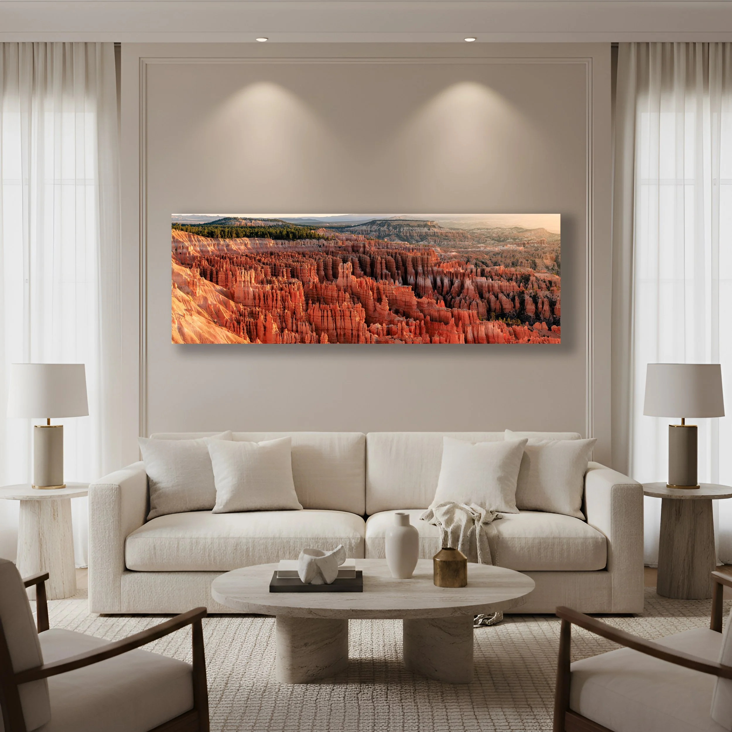
“Symphony of Stone” The first light of sunrise illuminates the orange hues of the Bryce Canyon Amphitheater. “Symphony of Stone” delivers a warm earthy palette perfectly aligned with the current trend toward organic interiors.
The most common mistake people make when choosing wall art is thinking too small. A print that’s too modest for the wall it occupies will always look like an afterthought. It will float, lost and disconnected, rather than anchoring the room the way a true statement piece should.
Here’s a simple principle to carry with you. Your art should cover roughly 60 to 75 percent of the available wall space. If you’re working with an open expanse of wall, multiply its width by 0.60. That’s your minimum size. Anything smaller and the room will feel unresolved.
When you’re hanging art above furniture such as a sofa, a bed, or a credenza, let the furniture set the proportion. Your print should span approximately two thirds of whatever sits beneath it. A 90 inch sofa calls for a print around 60 inches wide. That relationship between object and art is what creates a sense of visual balance. It shows intention.
And don’t overlook orientation. In a room with high ceilings, a vertical portrait print draws the eye upward lending the space even more height and drama. In a long low room, a horizontal landscape fills the wall with the same sweeping breadth as the scene it depicts.
Before you commit to anything, do this. Grab a roll of blue painter’s tape and outline the exact dimensions of the print you’re considering directly on the wall. Live with that rectangle for a day. Sit on the couch, stand in the doorway, look at it from across the room. If it feels too small then go larger. If it dominates then scale back. The tape test has saved more collectors from regret than any measuring app ever will.
Consider the Feeling You Want to Live With
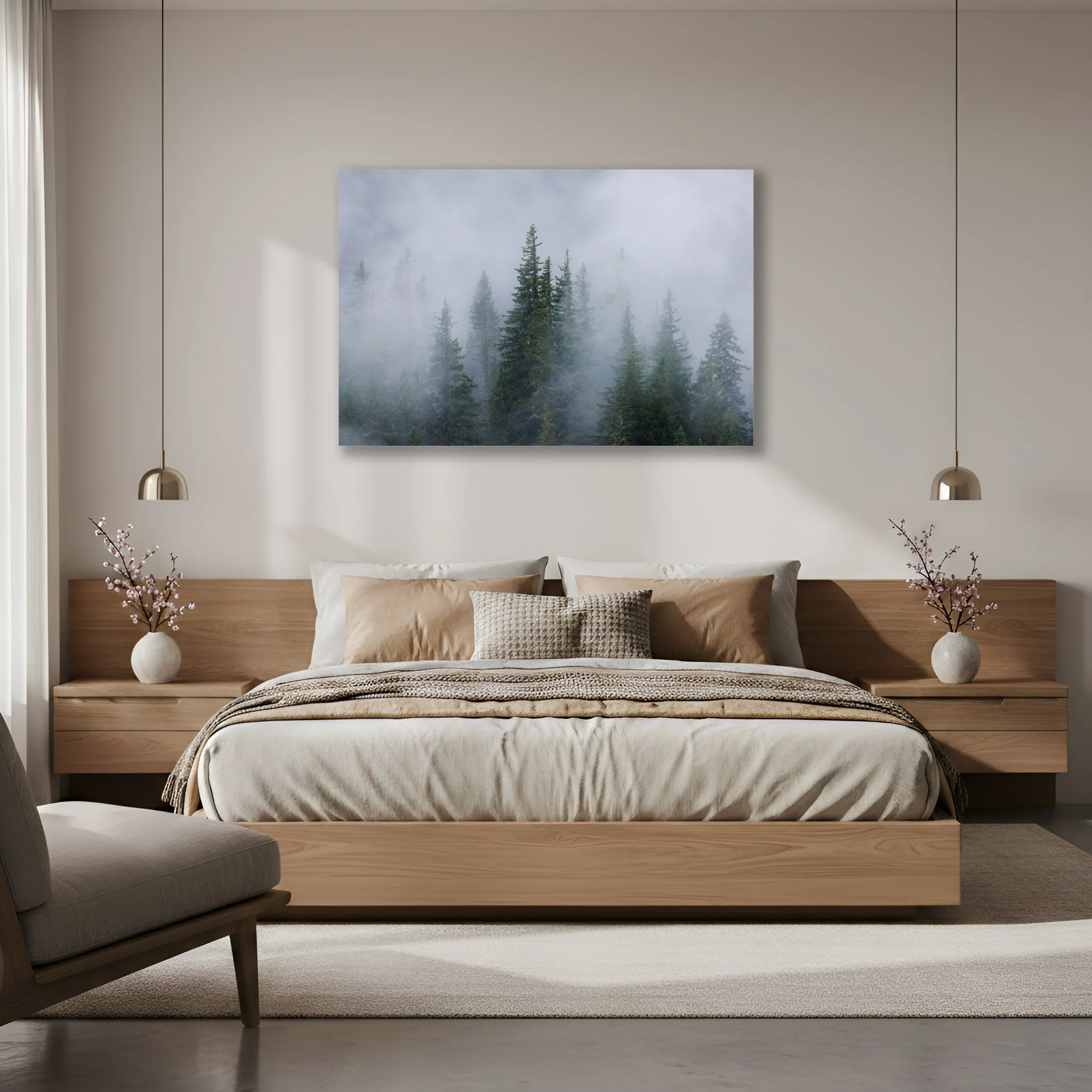
“Evergreen Dreams” Fog moves in and out of an evergreen forest in the Pacific Northwest. “Evergreen Dreams” muted grey and green tones along with meditative verticals brings a deeply calming mood to your bedroom.
Every great piece of art makes you feel something. Before you choose a subject ask yourself this question. How do I want to feel when I walk into this room?
Some spaces call for stillness. Soft light, open sky, the quiet of a misty forest or the hush of a snowfield. Bedrooms and bathrooms thrive with this kind of imagery. The goal is rest. The goal is to exhale.
Other rooms are made for energy. A living room or entryway welcomes prints that demand attention. The electric green of a tropical canopy, the flame of an autumn forest, the vivid geometry of a wildflower in full bloom. These are conversation pieces. They invite you in.
And then there are the spaces where you do your most focused work. A home office or den benefits from something grounding. Earthy, steady, geological. The vast silence of a canyon. The weight of a mountain. These images don’t distract you, they anchor.
When in doubt look around at what’s already in the room. If your textiles are neutral, soft linens, quiet grays, then a bold and vivid print will elevate the whole space. If the room already has color and personality then a more serene image can bring balance without competition.
Works with Your Color Palette, Not Against It
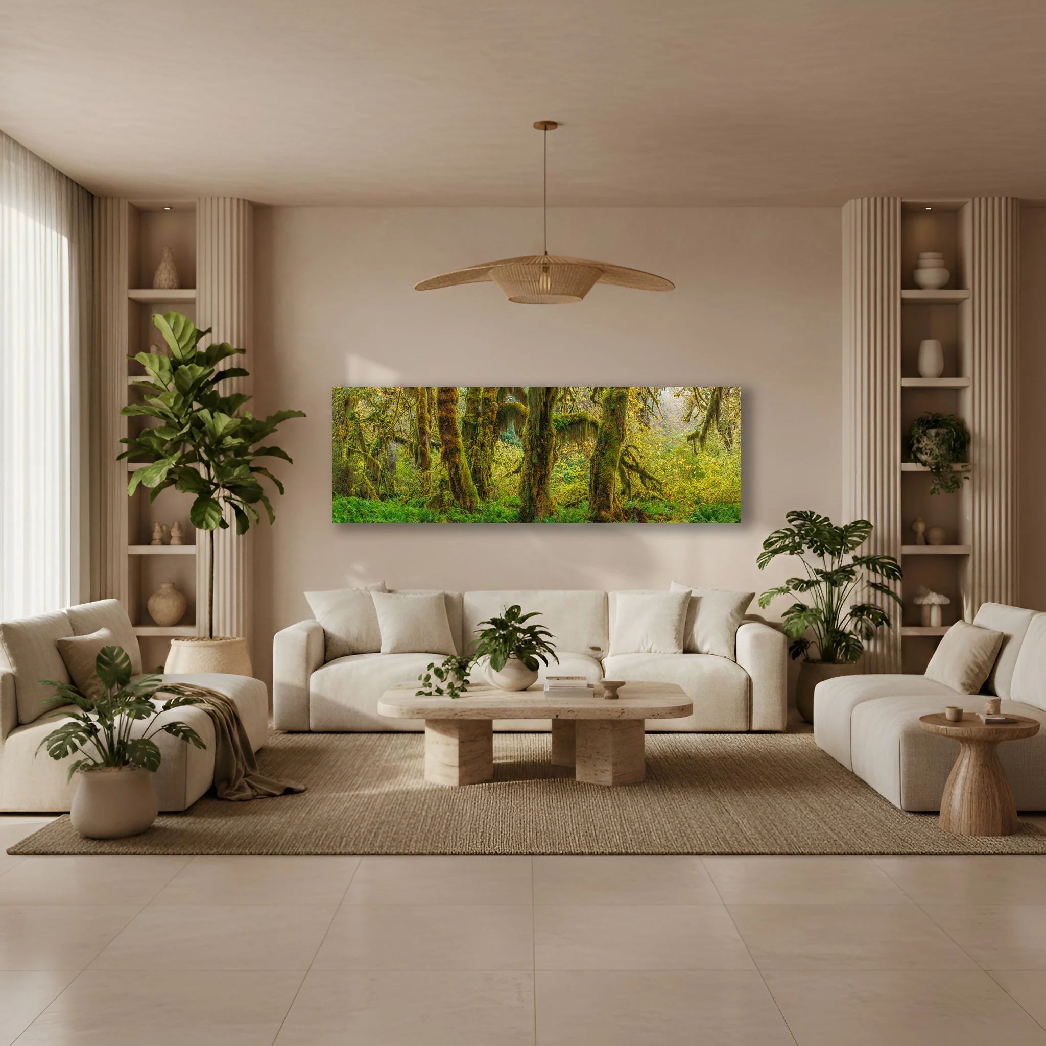
“Hall of Mosses” The lush emerald cathedral of moss draped maples in the Hoh Rainforest. “Hall of Mosses” is perfect for clients searching for nature immersive interiors and biophilic design.
Color is the language your room is already speaking. Your print should join that conversation, not interrupt it.
If you want your art to become the undeniable focal point of the room, look for colors that contrast with your walls. A deep green forest print on a warm terracotta wall doesn’t just coexist, it vibrates. That tension between opposites is what makes a room feel alive.
If you’re after something more cohesive, more quietly elegant, look to the colors already present in your rugs, throw pillows, and curtains. A stormy coastal print paired with navy blue textiles doesn’t shout, it harmonizes. The room feels as though it was designed all at once with purpose.
And if your space is already rich with color, there’s something to be said for a beautifully rendered black and white print. The absence of color isn’t a limitation, it’s a choice. Black and white nature photography offers extraordinary texture and depth that complements virtually any palette. It’s the piece that works with everything precisely because it doesn’t compete with anything.
Here’s a simple trick. Photograph your room on your phone and hold it beside the screen as you browse prints. If the colors make you pause, if something in you responds then trust that instinct.
Choose Materials That Honor the Image
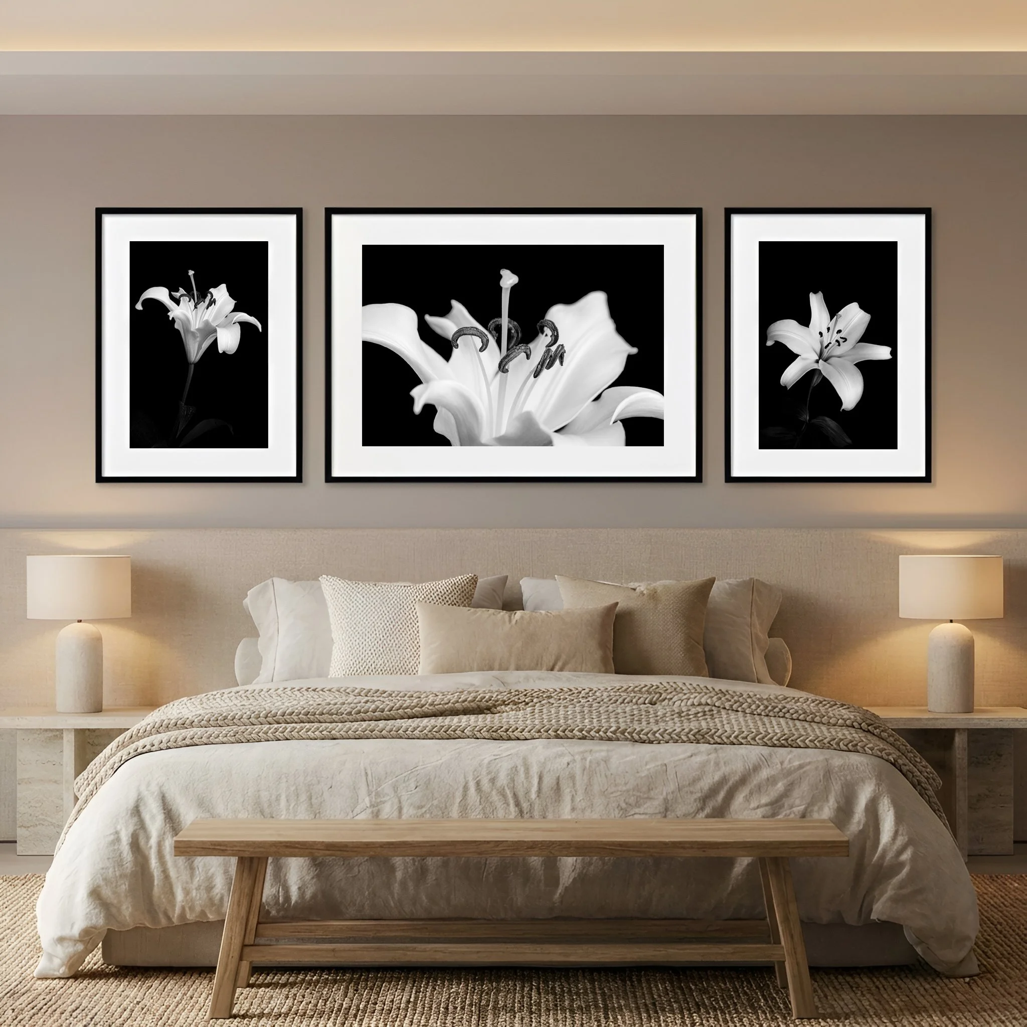
“Form of Lily Triptych” Three distinct photos tell the story of a lily. The shape and the details that make up the form of the flower. “Form of Lily Triptych” shown here printed on fine art paper, mated and framed above the bed, bring an inviting and peaceful mood to the bedroom.
The photograph is only part of the experience. The material it’s printed on shapes how you engage with it every single day.
A fine art paper print framed behind museum glass carries a sense of permanence and craft. It suits a traditional space or a clean modern minimalist room with quiet walls and considered furniture. There’s a warmth to paper, an intimacy. You’re aware that you’re looking at something made with care.
Metal and acrylic prints are a different experience entirely. Colors run deeper, luminosity increases, and the image seems to glow from within rather than simply sit on the wall. These finishes suit bold, high-definition images. A mountain lake or a sunset that feels almost unreal. They’re sleek, durable, and remarkably easy to live with.
One note on lighting. If your space receives a lot of natural light or has bright overhead fixtures, be thoughtful about reflective surfaces. Glossy glass and high sheen acrylic can catch the light in ways that obscure the very details you fell in love with. In a sun drenched room, a matte finish is your ally.
Place It with Intention
Height matters more than most people realize. In museums, curators follow a simple standard. The center of every piece hangs at 57 inches from the floor. This is average eye level for most people and it works because it creates a natural, comfortable relationship between the viewer and the image. Art hung too high feels remote. Art that is too low loses its authority.
There is one exception. When hanging above furniture leave six to eight inches of breathing room between the bottom of the frame and the top of whatever sits beneath it. That gap is what keeps the art connected to the room rather than hovering above it.
And if you’re hanging something substantial take the extra moment to find your wall studs or use proper anchors. A statement print is an investment. It deserves to stay exactly where you intend to put it.
Trust What Moves You
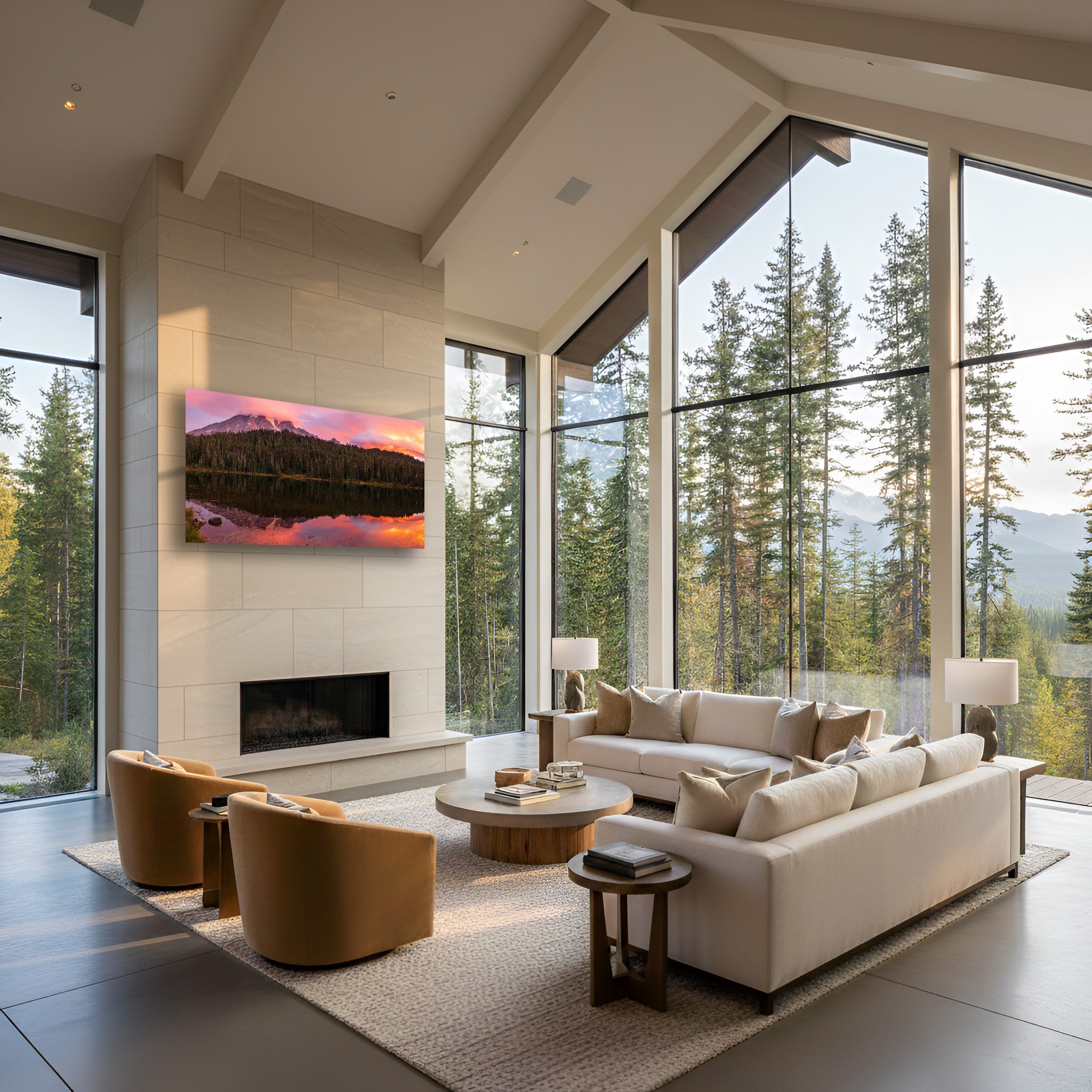
“Crowned By Dawn” Mount Rainier perfectly mirrored in Reflection Lake as the sky erupts with the pink and rose gold colors of sunrise. “Crowned By Dawn” brings presence to the room and makes a great statement piece.
The measurements, ratios, and color principles are tools, not laws. They exist to give you confidence. Not to replace your own response to an image.
If a print stops you mid scroll because it reminds you of a morning you’ll never forget. The light through the trees on a particular hike, the stillness of a lake before anyone else was awake. That recognition is worth more than any formula. Your home should reflect who you are and what you love. Not the pages of a design textbook.
The right nature print isn’t just something you hang on a wall. It’s something you live with. Something that changes the quality of an ordinary Tuesday. Something that when you glance up from whatever you’re doing, makes you breathe just a little easier.
That’s the one test that matters. When you walk into the room and your eyes find the print, does something in you settle?
If the answer is yes, you’ve found your piece.