Why Earth Toned Nature Art Belongs on Your Walls in 2026
We live in a world that is increasingly loud, fast, and disconnected from the natural world. Our homes should be our sanctuary. Too often though, our walls are filled with cold sterile nothing. Stark whites, blank grey. These spaces look like they've been staged for a real estate listing rather than actually being lived in.
Something is shifting in 2026 and I think it's long overdue.
Interior designers are calling it warm minimalism. I'd call it a return to what actually matters. Bringing the quiet grounding energy of the natural world back inside with us. Not through clutter or through cheap seasonal trends, but through intentional and meaningful art that makes you feel relief the moment you walk into the room.
Beyond "Sad Beige" — The Colors That Actually Breathe Life Into a Space
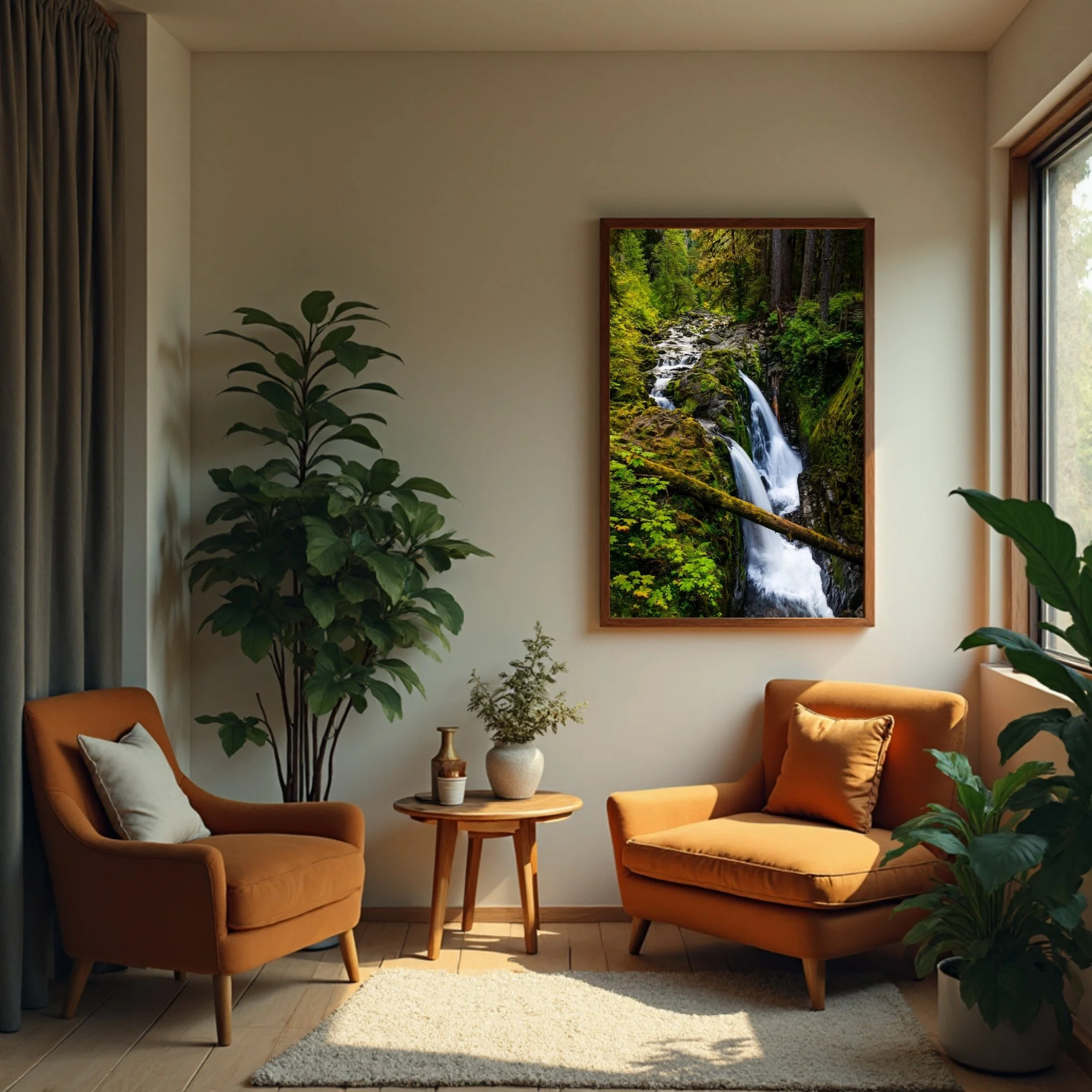
“Sol Duc Falls” Running at a lower level just before the autumn rains, only two sections are flowing over the edge. “Sol Due Falls” green tones go perfectly with the warm furniture colors creating a corner oasis.
For years minimalism meant an absence of color. White walls, grey furniture, the visual equivalent of a waiting room. People began calling it "sad beige," and they weren't wrong. A space without warmth isn't peaceful, it's empty.
The palette that's resonating right now pulls directly from the earth itself. Terracotta and clay carry the warmth of handmade pottery. The feeling of sun baked desert earth, of something that feels like it has history. Sage and deep moss do what spending actual time in a forest does. They quiet the nervous system and remind you that something much older and steadier than your inbox exists just beyond your door. Ochre and raw umber cast a permanent golden hour glow. The kind of soft amber light that makes everything feel a little more human.
There's real science behind why these tones work. Exposure to nature inspired greens and warm earth tones has been shown to lower cortisol levels by up to 18%. Your nervous system recognizes these colors. They signal safety and rest. They tell some ancient part of your brain that you are somewhere worth stopping.
The Art That Belongs in This Space
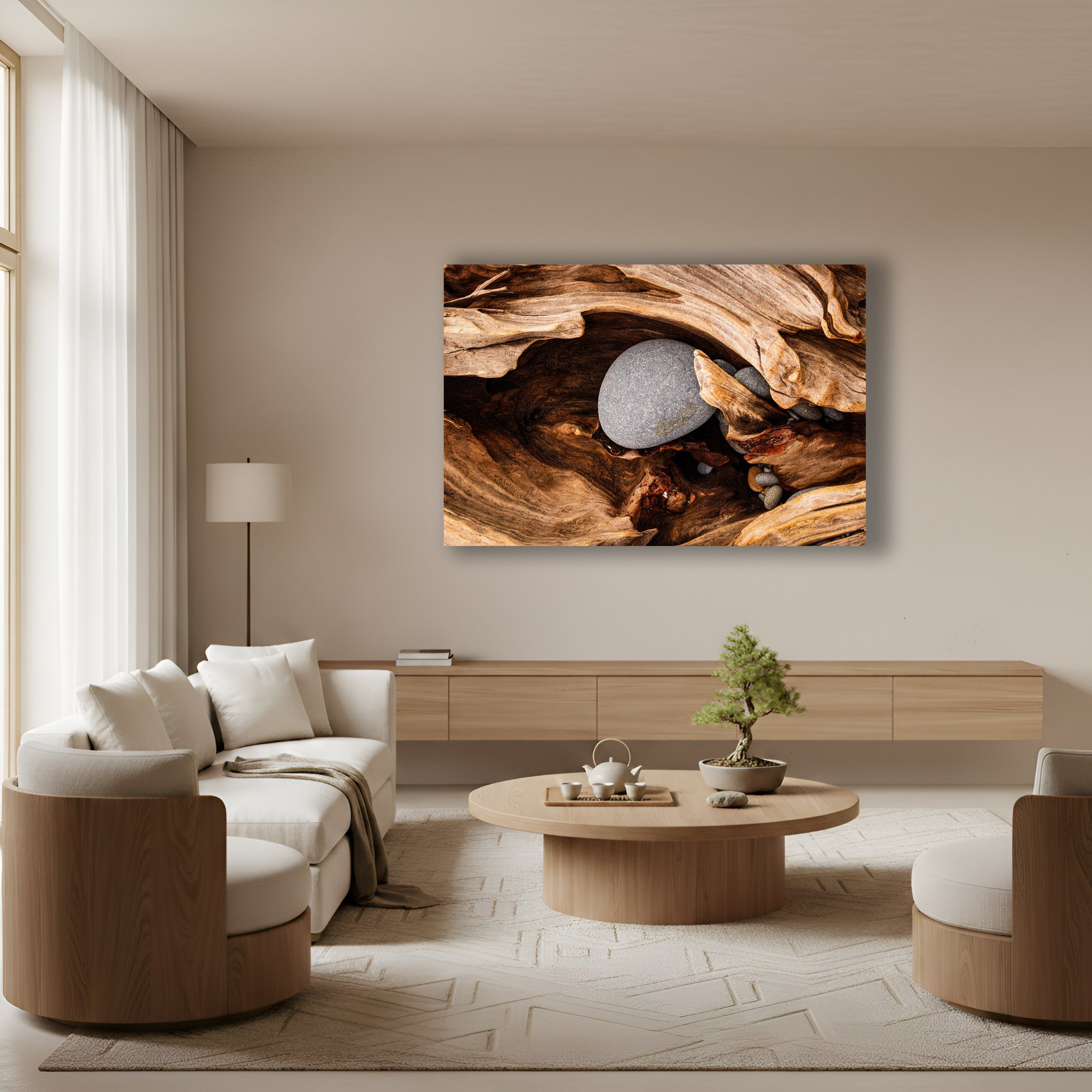
“Guardian’s Embrace” The piece of driftwood embraces the rocks inside a hole in the log. The visual language of “Guardian’s Embrace” allows your eyes to wonder around the textures of the wood and stones.
In 2026, the nature prints worth hanging aren't illustrations from a field guide. They're art that makes you feel something. Images that invite your eyes to slow down and wander rather than scan and move on.
The styles I'm seeing resonate most deeply are the ones that honor nature's own visual language. Abstract botanicals replace rigid botanical drawings with something that feels alive and in motion. Macro photography brings you face to face with the texture of moss, the grain of stone, the quiet geometry of sand. These close up views remind you that the natural world is endlessly intricate if you're willing to look. And then there are the fractal patterns. The Fibonacci sequences that spiral through a sunflower head, a nautilus shell, a breaking wave. Your brain recognizes these patterns before you consciously register them. They create an instinctive sense of order and peace.
What all of these have in common is that they ask you to be present. Not to scroll past but to stand still and look.
What the Art Is Made Of Matters
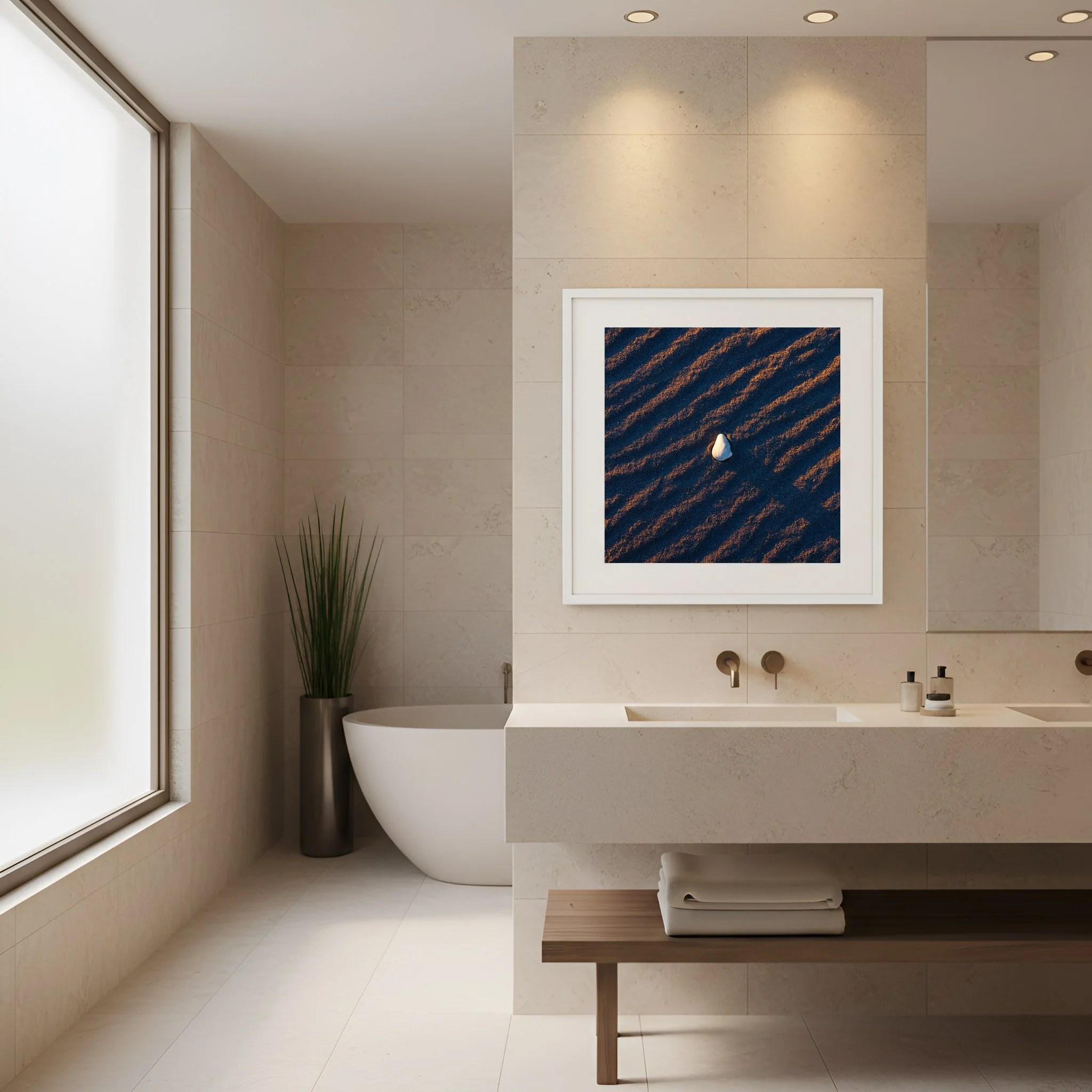
“Held By The Light” A lone shell sits on ripples of sand as sunrise illuminates the gentle ridges in the sand. “Held By The Light” brings nature’s textures and colors into the bathroom.
A print that celebrates the natural world should be made with respect for it. This is something I feel personally. It's why I use only museum grade materials and donate 5% of every sale to conservation.
The broader industry is catching up. Hemp paper which requires a fraction of the water conventional paper demands and grows rapidly without depleting the soil is becoming a standard for quality fine art printing. Soy based inks replace petroleum derived chemicals with biodegradable alternatives that actually produce richer longer lasting color. And frames are being stripped back to their raw material. White oak left in its natural sandy state or smoked walnut allowed to show its true warmth. No heavy lacquers or plastic veneer. Just the wood as it actually is.
When the entire piece, the image, paper, ink, and frame honors the natural world, it stops being décor and starts being a statement about what you value.
How to Hang It
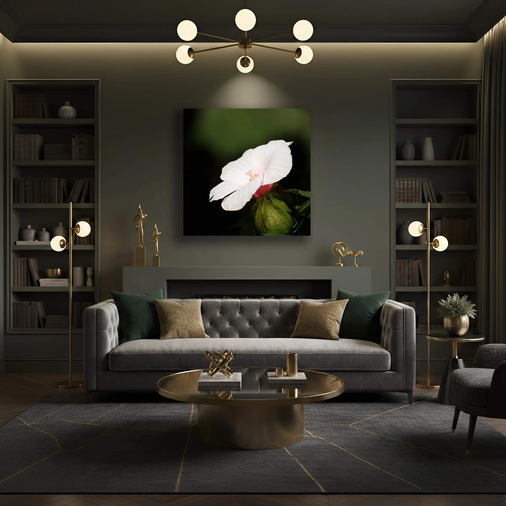
“Swamp Mallow” Soft white lines of the hibiscus stand apart from the green tones of nature surrounding the flower. “Swamp Mallow” pops with white but the greens of the background mirror the wall and decor of the room.
If you've been drawn to gallery walls, the clusters of many small prints, I'd encourage you to reconsider. That approach often creates visual noise, the opposite of what we're after. In 2026 the most powerful move is a single oversized focal point. One large piece that commands a wall and gives your eyes somewhere to land and rest.
The technique designers call "color drenching" takes this a step further. When the primary tones of your print mirror the wall behind it, the art doesn't compete with its surroundings, it becomes part of them. A terracotta print on a terracotta wall doesn't disappear. It creates a seamless warmth that wraps the entire room. The effect is less "art on a wall" and more “the room itself is the sanctuary.”
Hang your prints near soft shapes. Rounded mirrors, curved furniture, or arched doorways. The organic lines in nature photography or botanical art echo these forms naturally. The room begins to feel less like a collection of objects and more like a single coherent breath.
Fewer Things, Chosen Carefully
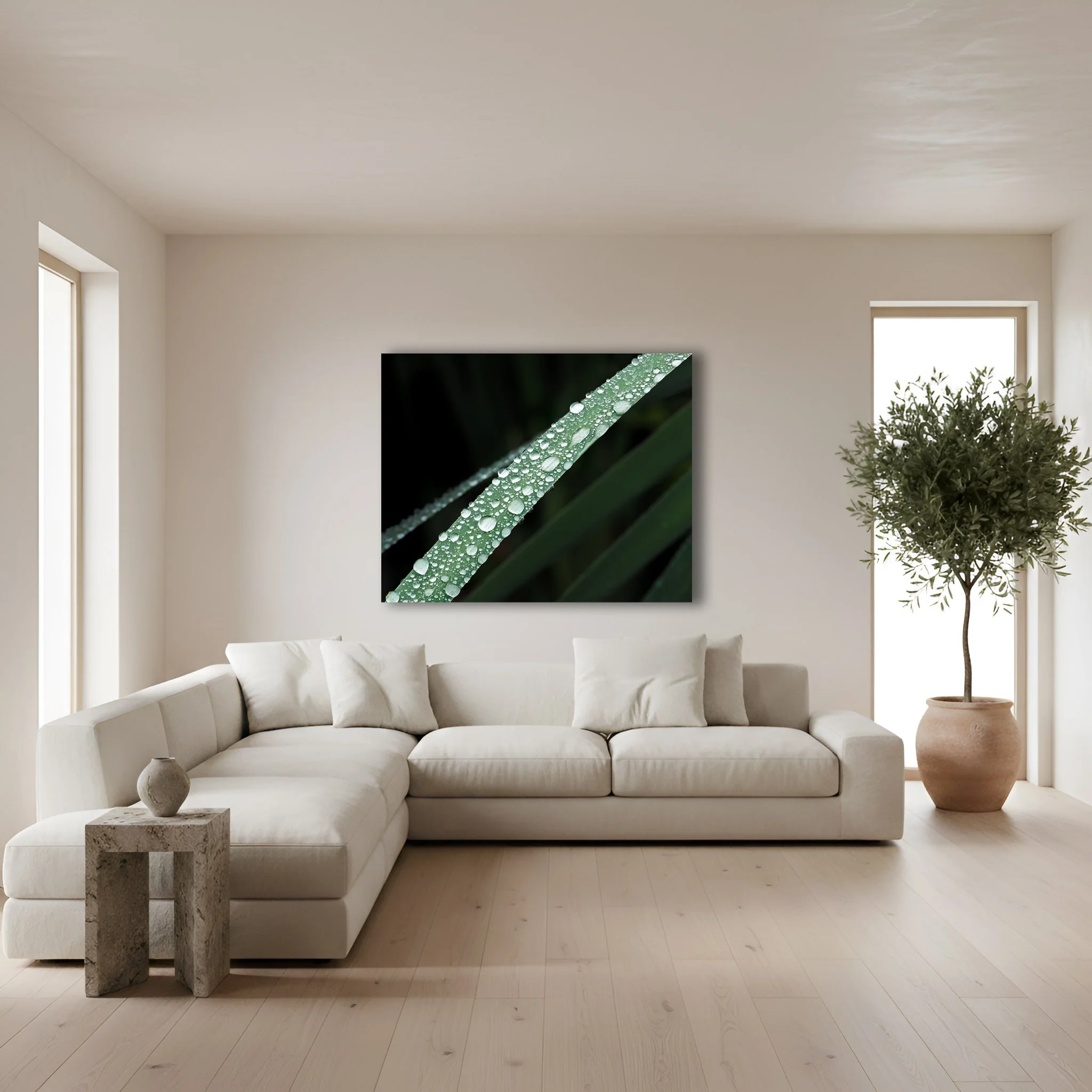
“Bejeweled” Water droplets rest on this macro shot of a blade of grass. The natural colors of “Bejeweled” will never go out of style as other fads pass with time.
The most lasting lesson of Warm Minimalism is the same one that guides how I approach my own work. Fewer and better things. One high quality meaningful print in a natural wood frame does more for a room than a dozen disposable pieces combined.
Natural colors like sage, terracotta, ochre, and clay don't go out of style because they aren't trends. They are the colors of the world that existed long before interior design was a concept and will exist long after the next aesthetic cycle fades. When you choose art rooted in those colors, in natural textures, in respect for the natural world, you're not decorating for the season. You're building a space that will still feel true to you years from now.
We spend so much of our lives staring at screens under fluorescent lights disconnected from the very planet we depend on. Our homes are one of the few places where we have genuine control over the environment around us.
Hanging a piece of nature art that you chose carefully, that actually moves you, is a quiet act of reconnection. It's a window to the wild when you can't be out in it. It's a reminder that every time you walk past it, that the world is still extraordinary and still worth protecting.
That's what great nature photography should do. Not just fill a wall but fill the room with something that matters.