How to Style an Office with Luxury Nature Wall Art
Most offices weren't designed to inspire us. They were designed to contain us. Four walls, overhead fluorescent lighting, and furniture that exists purely out of function. And if you've ever spent eight hours inside one, you already know what that can do to your mind.
But there's a different way to work. In 2026, the shift toward biophilic office design isn't a trend, it's a recognition that we are not meant to be so cut off from the natural world. When you surround yourself with images that speak to something deeper, a mountain range at dawn or the quiet geometry of a single leaf, you're not just decorating. You're rebuilding a connection your mind was always meant to have.
Choosing Art That Actually Moves You
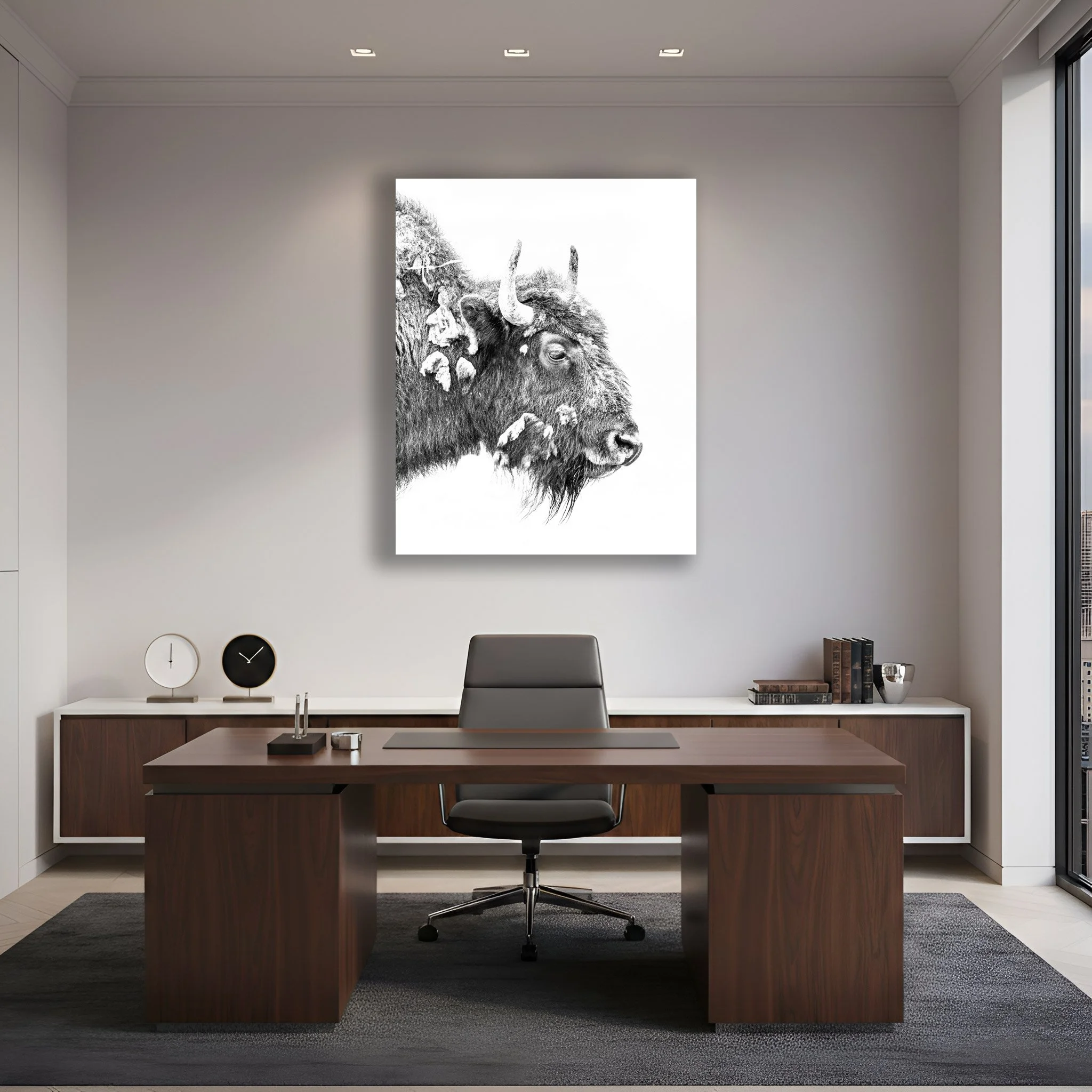
“Bison Bull” Part of the Quiet Sovereignty series of wildlife headshots. The high key imagery allows the piece to anchor the room without competing with existing decor.
There's a difference between art that decorates a wall and art that stops you mid thought. The first fills space. The second changes how a room feels the moment you walk in.
If you want your office to feel like a sanctuary rather than a showroom, move past the stock images. The predictable green forests, the generic coastal blues. Those images are forgettable because they were made to be. Luxury nature art invites you to look differently.
Three subject styles worth considering:
Macro Botanicals: Extreme close ups that transform a single leaf or mineral into something almost architectural. Nature turned abstract, precise and quietly breathtaking.
Aerial Landscapes: A coastline or a forest canopy seen from above becomes a living painting of shape and color. It rewards attention. The longer you look, the more you understand what you're seeing.
Minimalist Wilderness: High contrast black and white photography. A lone tree, a ridgeline in the fog, or a stretch of snow all can carry a stillness that anchors a room. It never overstates. It never goes out of style.
Medium and Material: Where Craft Becomes Quality
The image matters. But so does how it's made. Fine art doesn't live in a flimsy frame. Look for materials that reflect the care that went into creating the work:
Museum Grade Acrylic: Deep saturated color with a glass smooth finish that commands the wall. Feels gallery worthy and not mass produced.
Chroma-Luxe Metal: Vibrant colors with a sleek contemporary presentation that brings photos to life.
Fine Art Paper: Tactile and timeless, fine art paper brings a soft feel that pairs beautifully with natural wood furniture.
Placing Art with Purpose
Even the most powerful image can disappear on the wrong wall. Placement isn't an afterthought, it's part of the curation.
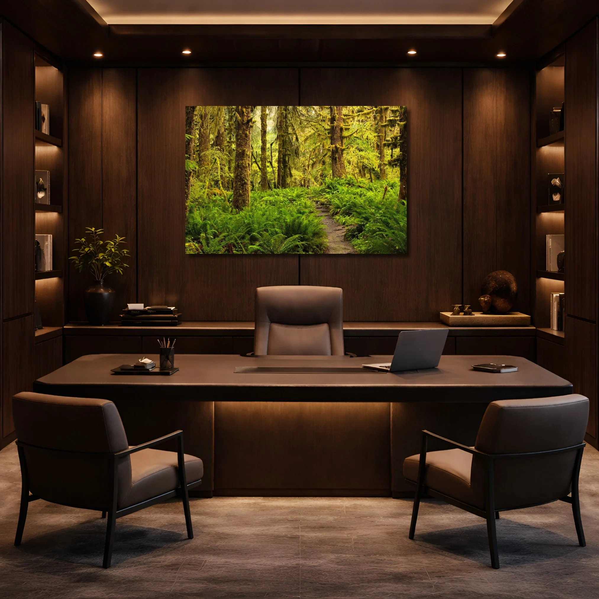
“Where the Forest Breathes” A trail leads though the rainforest in Olympic National Park. The biophilic aspects of this nature print bring peace to workspace.
The Wall Behind Your Desk
In a world of video calls, the wall behind you has become part of how the world sees you. A piece of nature art communicates something about who you are before you speak. Choose something that reflects the clarity you bring to your work.
Hang at Eye Level. Always.
The most common mistake is hanging art too high. Keep the center of your piece at eye level, roughly 57 to 60 inches from the floor. When art is properly grounded, the room settles. It feels intentional and everything breathes.
One Bold Statement or a Triptych?
A single oversized piece reflects you as confident and uncluttered. It says you know exactly what you want. A triptych, one image across three panels, brings rhythm to a wide wall without overwhelming it. Both work beautifully in an office space. The choice comes down to how you want the room to feel, decisive or expansive.
The Colors That Help You Think
Color isn't just decorative, it's physiological. The right tones change how you feel in a space and by extension how you work within it.
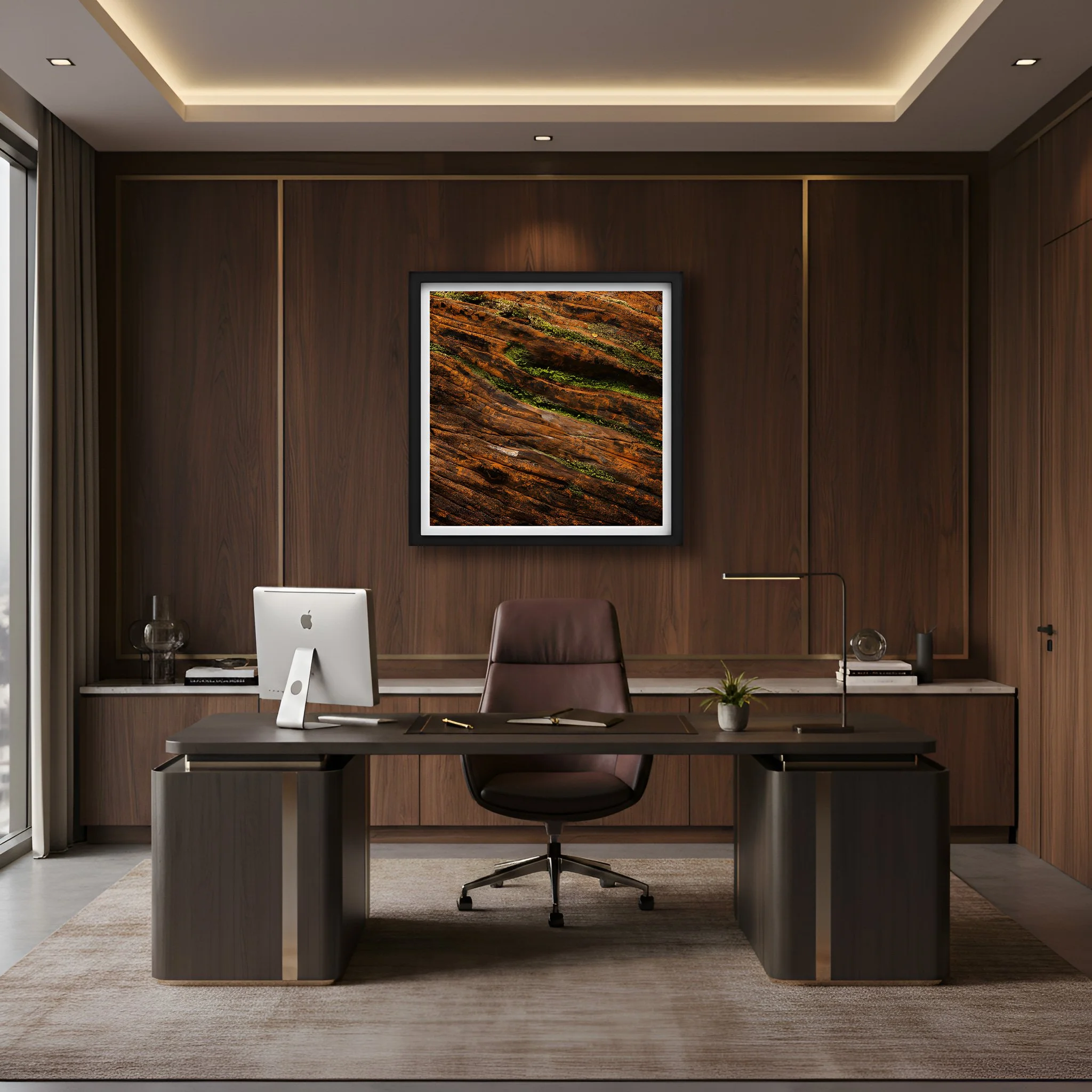
“Written by Time” A fine lines that only come with age of this weathered cherry tree. Earth tones in “Written by Time” make your office feel stable and grounded.
Green: Your Eyes Already Know
Green is the easiest color for the human eye to process. After hours of screen glare, a large piece of forest or moss toned art gives your visual system a place to rest. It's not passive, it actively restores your capacity to focus. This is exactly what a serious workspace demands.
Earth Tones: Grounded and Steady
Ochre, sands, and deep brown. These are colors that carry weight without heaviness. They make a room feel stable. When you work inside a space that feels grounded, your thinking follows. The decisions you make in that room feel steadier too.
Let the Art Speak to the Room
Great art doesn't exist in isolation, it converses with everything around it. Match your frame to the wood grain of your desk. Echo the metal finish of your lighting in the finish of your frame. When your art feels like it belongs, the whole room feels like it was designed by someone who pays attention.
The Finishing Details That Elevate Everything
There's a version of fine art that hangs on the wall and quietly disappears. Then there's a version that stops people when they enter the room. The difference is almost always in the details.
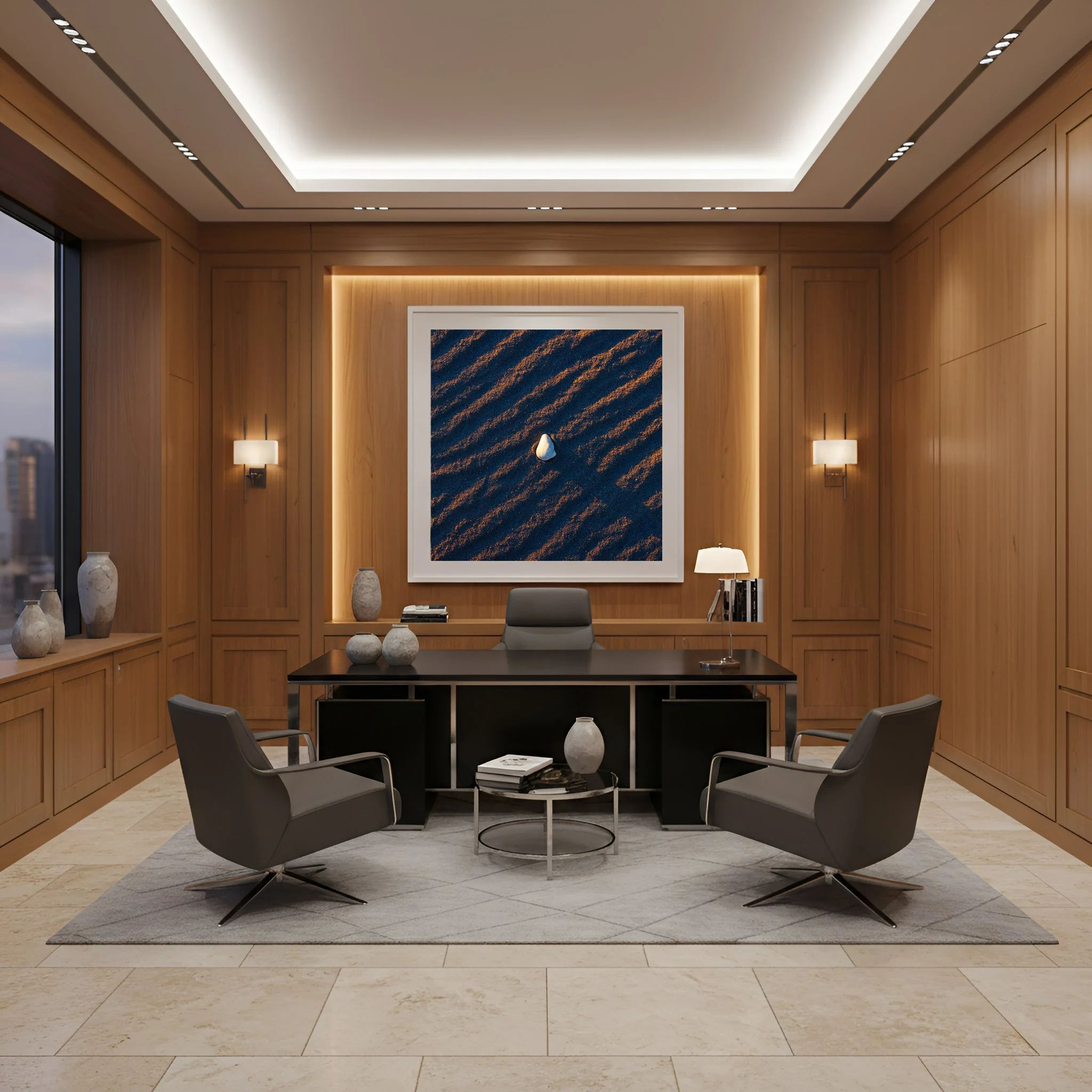
“Held by the Light” The sun rises on a single shell casting a long shadow. The mat surrounding “Held by the Light” gives the print room to breath and adds depth to the image.
Frame It Like a Gallery Would
The frame isn't an afterthought, it's part of the art:
Float mounts for metals and acrylics: a small gap between the image and the wall creates the illusion that the piece is hovering. Clean, modern, striking.
Deep set mats for fine art paper: that generous border of mat board between glass and image adds depth. It transforms even a quiet nature photograph into something museum worthy.
Light It Intentionally
Overhead office lighting is almost always wrong for art. It creates glare and flattens the colors. Dedicated picture lights, small lamps that cast a warm downward glow or recessed directional LEDs pointed at your piece will do something remarkable. These lights will make the colors come alive. They tell everyone in the room exactly where to look.
Layer in the Living World
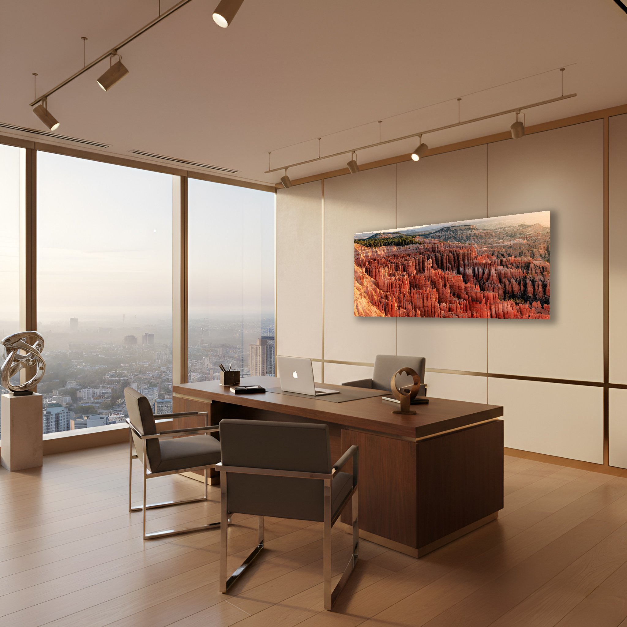
“Symphony of Stone” The sun rises over the hoodoos of Bryce Canyon National Park. Warm natural tones bring life to an otherwise dull office.
The truest expression of biophilic design doesn't stop at the wall. When art and real nature exist together in the same space, something shifts. The image on the wall and the plant in the corner begin to speak the same language. The room becomes an environment, not just a collection of objects.
Place a fiddle leaf fig beside a large forest piece. Set a bonsai or a single succulent on your desk near a smaller work. These aren't decorative gestures, they are continuations of the same idea. That you belong to the natural world, even here while working.
And let texture carry that conversation further. Soft, mossy landscapes pair with wool rugs and linen curtains. Rugged mountain photography looks completely at home beside leather and solid wood. When what you see on the wall echoes what you touch and sit in, the room stops feeling assembled, it feels alive.
Your Office as a Reflection of What You Value
The office you work in is not neutral. It either supports your best thinking or it quietly drains it. The walls either remind you why the work matters or they say nothing at all.
Styling your office with luxury nature photography is really about something simpler. Building a space that keeps you connected to the world that made you. When your environment is beautiful, grounded, and purposeful you show up differently. You think more clearly. You feel less scattered. You're reminded quietly every single morning of what actually matters.
That's worth curating.
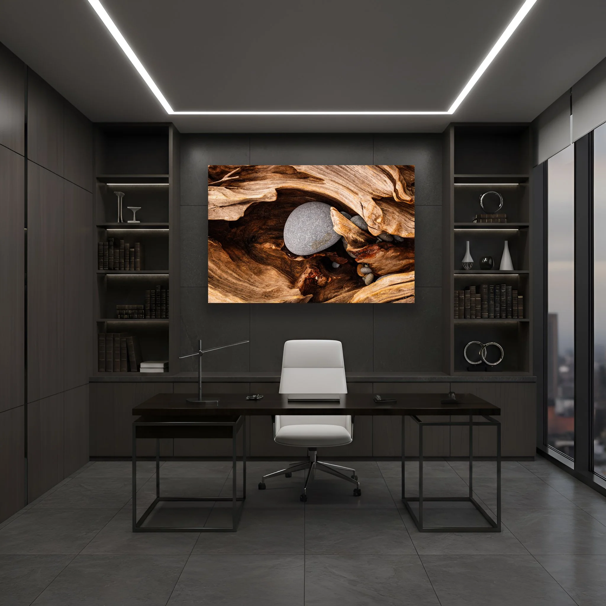
“Guardian’s Embrace” Driftwood that has washed ashore and been filled with rocks from the nearby surf. The warm earth tones contrast with the slate gray of the office bringing a piece of nature to an otherwise sterile environment.